Color is a craftsperson’s quiet collaborator. It steers attention, sculpts mood, and makes hand-built pieces feel intentional, alive, and wearable. In jewelry, where scale is small and materials are tactile, color theory does more than guide palette choices—it affects perceived balance, sparkle, and the way a piece sits against skin and fabric. This article connects timeless principles of color with the constraints and freedoms of handcrafted jewelry, from bead-weaving and metal-smithing to polymer clay, enamel, resin, and textile-based adornment.
Why Color Matters in Handcrafted Jewelry
Jewelry is intimate. It lives close to skin, in changing light, against moving fabrics. Even a minimal necklace is a moving color study: the sheen of metal next to a gemstone, a thread’s tiny halo, a shadow cast by a textured surface. When a palette is chosen with purpose, it elevates craftsmanship—amplifying shape, clarifying focal points, and helping each technique speak clearly.
For handcrafted work, color choices influence:
- Perceived workmanship quality: well-chosen palettes suggest confidence and skill, even when techniques are simple.
- Durability of appeal: thoughtful color contrast and subtle neutrals keep limited-edition pieces timeless.
- Storytelling: ceremonial reds, sea-glass blues, sun-warmed ambers—each hue can anchor a narrative.
- Comfort and wearability: palettes that flatter skin tones and wardrobes increase daily use and emotional attachment.
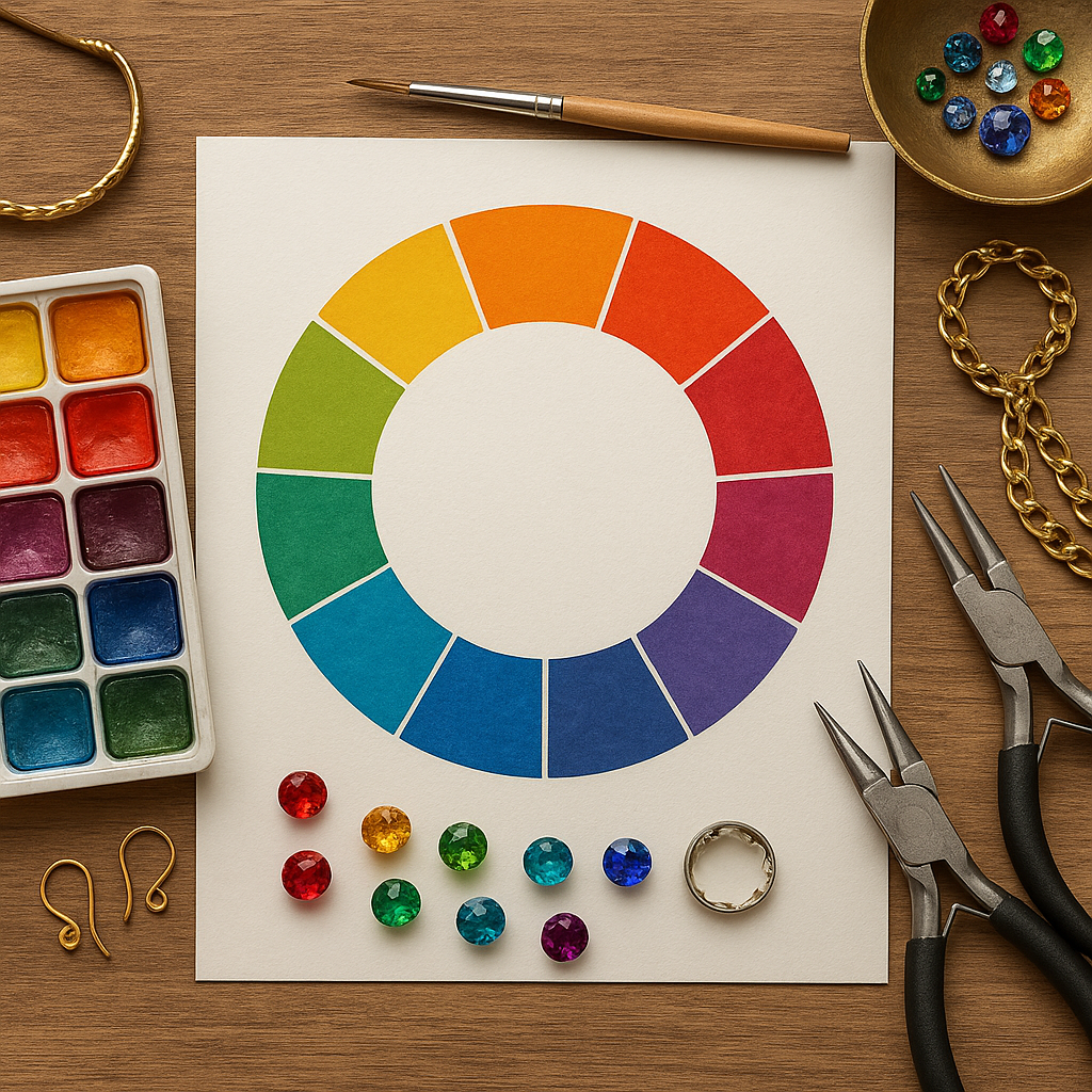
The Color Wheel for Jewelers
Artists often learn a painter’s wheel, but jewelers benefit from thinking in materials: metals as neutrals, stones as light filters, enamels as pigments, textiles as both color and texture. Still, the wheel remains a powerful map for predicting how colors will interact.
Primary, Secondary, and Tertiary
On a traditional color wheel, primaries (red, blue, yellow) combine to create secondaries (orange, green, purple), which blend into tertiaries. For jewelers, the wheel isn’t just theoretical—it relates directly to available stock. A purple amethyst and a green peridot aren’t generic purple and green; they’re optical filters with particular saturation and undertone. Enamel colors labeled “transparent,” “opal,” and “opaque” shift how the wheel behaves on metal.
Circular Thinking, Linear Making
Design develops linearly—sketch, prototype, revise—but color relationships often loop back. A palette may feel perfect until the clasp is switched from brass to silver; suddenly the piece cools, and the balance shifts. A wheel helps diagnose why a piece moved warm or cool, bold or subdued, and how small adjustments bring it back into harmony.
Essential Vocabulary for Color Decisions
These foundational terms translate painterly concepts into jewelry practice. A little precision in language makes decisions faster and more consistent.
- hue: the family name of a color (red, blue, green), independent of lightness or intensity.
- saturation: the intensity or purity of a color. High-saturation stones feel vivid; desaturated textiles read subtle, vintage, or earthy.
- value: the lightness or darkness of a color. Value contrast is the single most powerful tool for creating focal points in small-scale work.
- temperature: the warm–cool bias of a color. Warm hues advance visually; cool hues recede, changing the composition’s depth.
- undertone: a hidden bias that appears in context. A “neutral” gray cord may lean green; a champagne topaz may lean pink.
- contrast: the difference between elements (value, hue, texture). High contrast draws the eye; low contrast soothes.
- harmony: a pleasing relationship among colors; not necessarily quiet—dramatic harmony is possible when relationships are intentional.
- complementary: colors opposite on the wheel; potent for vibrancy and energy.
- analogous: neighbors on the wheel; gentle blends ideal for gradients and beadweaving flows.
- triadic: three evenly spaced hues; playful and balanced when value is controlled.
Material Optics: How Jewelry Media Shape Color
In jewelry, color is not only pigment. It is reflection, refraction, and interference. Material choice can intensify, soften, or entirely transform a palette.
- Transparent gemstones: act like windows and filters. Aquamarine or citrine shifts with background metal; open-back settings let clothing color influence the stone.
- Translucent stones (prehnite, chalcedony): bloom with inner light; value reads softly, making them excellent for gradients.
- Opaque stones (turquoise, onyx): behave like matte paint swatches—predictable, graphic, and powerful for contrast.
- Glass beads: surface finish (matte, AB coating, metallic) changes the perceived saturation and value without changing hue.
- Enamel: fired glass that can be layered. Transparent enamels intensify over reflective metals; opaque enamels behave more like ceramic glaze.
- Resin: easily tinted and cast; embedded inclusions introduce micro-contrasts and depth reminiscent of watercolor.
- Textiles (silk, linen, cotton, leather): fiber sheen affects brightness; twist and weave create shadows that read as low-value accents.
- Metals: silver cools palettes; yellow gold warms; rose gold adds a soft red undertone; brass and bronze bring antique warmth; blackened steel or oxidized silver adds dramatic low value without adding hue.
Color Harmonies for Wearable Composition
Color harmony organizes the eye’s journey across a piece. In wearable scale, extra attention to value and temperature keeps small designs legible.
Complementary Energy
Pairing opposites (blue–orange, purple–yellow, red–green) yields high energy. Use with care: too much 50/50 can feel noisy. Often a 20/80 ratio with a neutral metal stabilizes the result. In bead embroidery, a ring of matte seed beads around a high-saturation stone dampens glare and keeps complements from vibrating.
Analogous Flow
Three or four neighbors on the wheel create gradients ideal for fringe earrings, kumihimo cords, or loom-woven bands. Anchor the sequence with a value step: pale to dark within one family keeps analogous palettes dimensional rather than flat.
Triadic Play
Triads are lively and modern, but value control is crucial. If all three are equally saturated and mid-value, the design can turn chaotic. Choose one dominant hue, one supporting, and one accent—then vary value with metal and finish.
Split-Complementary and Tetradic
Split-complementary (one hue plus the two flanking its complement) softens direct opposition, excellent for sophisticated bead mixes. Tetradic (two complementary pairs) can be rich; reserve it for larger statement pieces or modular sets to avoid visual overload.
Metal Choices as Color Strategy
Metals read as colored neutrals. They modulate temperature and value while contributing texture and reflectivity.
- Silver and white gold: elevate cool palettes; sharpen blues and greens; can desaturate warm stones slightly by comparison.
- Yellow gold and brass: warm the composition; brighten reds and oranges; help olive greens look elegant rather than muddy.
- Rose gold and copper: add gentle warmth; flattering against many skin tones; resonate with pinks and mauves.
- Oxidized finishes (silver, bronze): introduce built-in shadow, increasing depth and making lighter stones glow.
- Mixed metals: create micro-contrasts; excellent for neutral-heavy designs where color plays a supporting role.
Rule of thumb: choose metal after you confirm gemstone undertones. Switching metal late can shift the whole palette’s temperature and value relationships.
Texture, Finish, and Perceived Color
Finish is a color tool. Matte surfaces lower perceived saturation and value; high-polish surfaces raise them. Hammered textures break reflections into facets, making a single color feel more dynamic. In beadwork, alternating matte and glossy seed beads inside one color family adds rhythm without changing hue.
- Matte: reads sophisticated, reduces glare, emphasizes shape.
- Satin/brushed: soft glow; ideal when stones are highly reflective.
- High polish: increases perceived value (lightness) and saturation; works well to spotlight focal stones.
- Patterned/engraved: introduces micro-shadows that deepen color nearby.
Skin Tone, Wardrobe, and Real-World Context
Every piece lives in context. A necklace interacts with undertones of skin, lipstick, and collar fabric; bracelets live near watch faces and cuffs; earrings frame the eyes.
- Cool complexions: harmonize with cool palettes (blue, violet, icy green) and silver-tone metals, but can pop beautifully with warm accents like citrine set in gold.
- Warm complexions: glow with golds, corals, olive greens; cool accents in silver create striking contrast.
- Neutral complexions: flexible; focus on value contrast to avoid monotony.
Design for lighting too. Office fluorescents flatten reds and warm greens; evening incandescent lighting warms everything, making cool stones look more balanced; daylight reveals undertones ruthlessly. Always test palettes in multiple light sources.
Color Symbolism and Narrative
Handicraft often carries story. Color symbolism varies culturally, but common patterns guide choices when designing for markets or ceremonies:
- Red: vitality, celebration, protection; powerful in small doses as an accent bead or enamel stripe.
- Blue: calm, trust, depth; semi-transparent blues can read spiritual or maritime depending on metal pairing.
- Green: renewal, prosperity; olive and sage lend sophistication; vivid emerald reads regal.
- Purple: creativity, ceremony; pair with brushed metal to avoid feeling overly formal.
- White/Black: clarity and mystery; together they anchor bold palettes and communicate modernity.
Let symbols whisper rather than shout—embedding meaning in a clasp stone, spacer bead, or thread color keeps the piece wearable while honoring its narrative.
Practical Methods: From Swatches to Proto-Jewels
Color choices get better when they move off the screen and into three dimensions. Try these studio-tested methods:
- Bead boards and temporary stringing: assemble palette lines with 30–50 beads; vary finish to test subtle differences.
- Metal swatch sticks: keep small, finished coupons of your metals and patinas; hold against stones under different lights.
- Enamel chips: fire 1 cm squares on your usual base metals to see true color, not catalog photos.
- Thread and cord wraps: wind candidate colors around a scrap of metal to judge interaction with findings.
- Value-first photo check: shoot in black and white to confirm focal hierarchy before committing.
Try this: Build a “palette ring” on a split ring with tiny samples—metal chips, bead clusters, thread knots. Toss it in your bag so you can test colors next to fabrics while sourcing.
Color in Specific Handicraft Techniques
Bead Weaving and Embroidery
Small beads behave like pixels. Because each unit is tiny, value contrast communicates pattern more clearly than hue contrast alone. Alternate matte and glossy finishes to create depth within a single color. Use analogous gradients for backgrounds and a complementary accent for focal motifs.
Wire-Wrapping and Metalsmithing
Wire color and thickness frame stones like a drawing. Copper warms blue stones; sterling cools warm agates. Oxidize selectively to push back non-focal areas. For prong settings, choose prong color to either disappear (match stone) or dramatize (contrast stone).
Polymer Clay and Resin
With polymer clay, you mix color like paint, but remember baking shifts saturation and value; make test chips. Resin tints look darker in-pour than cured; embed metallic leaf to lift value. Keep a recipe log to repeat successes.
Textile Jewelry
Macramé, kumihimo, and soutache introduce braided shadows. Use two close values in the same hue to create soft dimensionality; add a thin high-value highlight thread to catch light and guide the eye.
Enameling
Transparent enamels intensify over reflective bases; use fine silver under cool palettes for brilliance and copper under warm recipes for depth. Opaque enamels function like solid paint—great for crisp motifs and high-contrast geometry.
Working With Neutrals and Limited Palettes
Neutrals are the designer’s breathing room. Metals, bone, horn, wood, and smoky grays let saturated stones shine without competition. Limited palettes (two colors plus a neutral) read intentional and upscale. For cohesion across a collection, fix the neutral (e.g., oxidized silver) and rotate accent hues.
- Warm neutrals: brass, bronze, tan leather, cream bone.
- Cool neutrals: stainless, hematite, slate cord, labradorite gray.
- Soft black: oxidized silver or gunmetal for elegant depth without harshness.
Translating Trends Without Losing Timelessness
Trends can be translated into handcrafted language by distilling them into hue, value, and finish. If “neon” is trending, try a single vivid accent bead against matte neutrals, or enamel a thin line rather than flooding a surface. When “earthy” palettes dominate, add a precise high-value highlight to keep the work from feeling dull.
Digital and Analog Tools
Use digital tools to generate palettes from photos of landscapes, textiles, or architecture; then verify with physical swatches. Colorimeters and smartphone apps can capture approximate hex values for repeatability in resin or clay. Still, nothing replaces a daylight check on real materials.
Troubleshooting Common Color Problems
- Design feels flat: increase value contrast, not just hue contrast. Add a single high-value highlight or deepen shadows with oxidation.
- Too busy: reduce the number of finishes before reducing colors. Unify beads by switching several glossy beads to matte, or vice versa.
- Clashing undertones: identify the culprit by isolating colors against neutral white; replace the odd undertone or adjust metal temperature.
- Stone disappears on skin: choose a brighter metal behind the stone, raise the value (lighter hue), or add a halo of seed beads for separation.
- Palette looks different in photos: calibrate white balance, photograph in diffuse daylight, and check black-and-white to assess value structure.
Sustainable and Ethical Color Choices
Color decisions intersect with sourcing. Recycled metals bring characteristic warmth (especially in brass and bronze). Vintage beads carry aged finishes that naturally desaturate palettes—use them intentionally to signal history. Lab-grown stones offer consistent hue and fewer inclusions; pair them with textured metal to avoid a too-perfect look. Natural dyes on silk cords can fade gracefully; design for patina by choosing colors that remain attractive as they mellow.
Exercises to Train Color Judgment
- Monochrome challenge: create a piece using only one hue across three values and two finishes. Aim for depth without changing hue.
- Complementary micro-accent: design a calm analogous bracelet and add exactly five beads of the complement. Place them where you want the eye to rest.
- Metal swap: build a palette and assemble a prototype on brass. Rebuild the same design on silver and blackened steel to compare shifts.
- Value map: sketch your design silhouette and shade it in grayscale first. Then assign materials to match the values.
- Light test: photograph the same piece in daylight, warm indoor light, and shade; annotate what shifts and how you’d compensate.
Care, Aging, and Color Stability
Color is not static. Copper will deepen, sterling may tarnish, dyed cords can fade, and some resins yellow under UV. Design with aging in mind:
- Intended patina: pair stones that brighten next to darkening metal (moonstone with oxidized silver) for evolving contrast.
- UV sensitivity: choose UV-stable resins and sealants; store samples on a sunny sill for a week to preview long-term changes.
- Replaceable accents: use easily swapped components (tassels, cords) for clients who want refresh options.
Building a Personal Color Language
Over time, consistent decisions become a recognizable signature. Maybe it’s a low-contrast base with a precise spark, or a devotion to soft blacks and milky stones, or luminous transparents over textured silver. Keep a palette journal with real material samples and notes on light, metal, and finish. When clients return, your language of color becomes part of your brand’s trust.
From Theory to Touch
Color theory gives names to instincts you already use at the bench: when you tape a stone beside a chain to “just see,” you’re testing value, temperature, and undertone; when you switch a clasp to stabilize a busy bead mix, you’re negotiating contrast and harmony. Let the wheel inform your choices, then let the materials—stones, metals, fiber, glass—tell you what they want under your hands. In handcrafted jewelry, color is not just seen. It’s felt in weight, heard in the soft click of beads, and discovered anew each time light shifts across the wearer’s day.