Packaging for handmade jewelry is more than a wrapper; it is a stage set, a quiet promise, and an intimate handshake between maker and wearer. The right choices turn a simple parcel into a keepsake, frame your work with intention, and carry the values of the studio that made it. While factory-made jewelry often relies on standardized boxes, artisan packaging thrives on tactile nuance, proportion, mindful sourcing, and small-scale ingenuity. The following guide explores how to design, build, and refine packaging that elevates your pieces, protects them in transit, and expresses what you stand for as a maker.
Why Packaging Matters for Handmade Jewelry
Jewelry is among the most emotionally charged objects we exchange: commitment rings, heirloom earrings, talismans of travel or growth. Packaging should mirror that emotional dimension. It communicates your aesthetic at the first touch; it preserves surfaces and stones; it signals value without wastefulness; and it extends your studio narrative into the customer’s home. Great packaging helps your customer feel seen, turning a purchase into a ritual that they’ll remember and share.
In practice, this means thinking beyond a single box: consider how outer mailers, inner wraps, jewelry cards, care notes, and finishings orchestrate a complete presentation. Each element can be humble and affordable yet carefully chosen to amplify your voice.
Foundations: Form Factors, Proportions, and Core Components
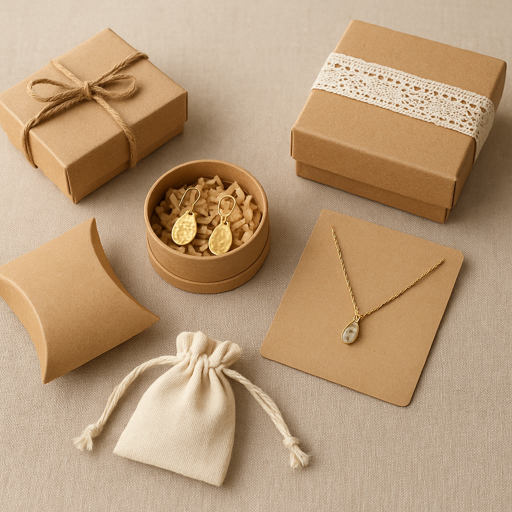
Most handmade jewelry can be presented across five common forms: rigid boxes, folding cartons, pillow boxes, drawstring pouches, and carded mounts. The best choice depends on the piece’s fragility, weight, and finish. Rings and studs benefit from compact shapes that keep items centered; necklaces often benefit from elongated or trifold formats that prevent tangling; bracelets require space for curvature.
- Rigid setup box: Premium feel, excellent structural integrity. Ideal sizes include 70×70×30 mm for rings/earrings and 90×90×35 mm for bracelets or pendants. Pair with foam, velvet pads, or die-cut paper inserts.
- Folding carton: Lightweight, shipped flat, lower cost. Increase perceived weight with double walls or a platform insert. Ideal for market stalls and online orders where postage weight matters.
- Pillow box: Elegant S-curve silhouette created by pre-scored arcs. Works well for lightweight items on a jewelry card plus tissue wrap. Great for festivals where speed and volume are key.
- Drawstring pouch: Cotton, linen, satin, or microsuede. Adds a reusable gift feel. Consider a small cardstock collar or backer card inside to prevent chain tangles.
- Card mount: For studs and minimalist pieces, a thick backer card slotted to hold jewelry. Slip into a glassine or compostable clear sleeve, then an envelope or box.
Focus on proportion. A box that is just slightly larger than the piece feels tailored. Oversized packaging can seem wasteful and allows pieces to rattle. Tailor insert thickness to stone height, and ensure prongs or ear posts don’t stress the lid. If you frequently offer customized lengths or sets, design a modular insert that adapts—removable slits for ear wires, perforated flaps for chain anchors, or foam with variable cutouts.
Substrates and Touch: Paper, Fabrics, and Alternatives
Surface tactility communicates as strongly as graphics. Cotton papers suggest softness and calm; kraft stock signals approachable simplicity; linen wraps evoke tradition; soft-touch films and velvet laminates feel luxurious. Consider archiving standards: acid-free, lignin-free, and sulfur-free packaging mitigates tarnish and protects gemstones. Pair inserts with tarnish-inhibiting strips when working with sterling silver, and include a note with care instructions.
Recommended specifications for durability and feel:
- Paperboard: 350–450 gsm for folding cartons; 600–1200 mic board for rigid boxes.
- Backer cards: 600–800 gsm duplexed with contrasting cores for elegant edges.
- Textiles: Organic cotton canvas (8–10 oz) for pouches; linen for breathable storage; microsuede for scratch-sensitive stones.
- Adhesives: pH-neutral, non-sulfur, and low off-gassing glues. For inserts, hot-melt adhesives that maintain bonds in transit temperature ranges (−10°C to 40°C).
Design Language and Visual Hierarchy
Think of your packaging like a miniature storefront. In a tiny space, you must establish identity, reassure with quality cues, and guide the eye to the hero piece. Maintain margin discipline around logos, use a limited palette to avoid visual noise, and plan a clear typographic hierarchy for brand name, maker info, and care notes. Minimalists may embrace one-color letterpress on textured stock; maximalists may play with pattern overwraps, brightly colored interior floods, or illustrated tissue.
Balance legibility and texture. Embossed type on a soft-touch lid feels luxurious; a foil-stamped monogram on raw kraft can feel modern-rustic. If you sell at markets, ensure your jewelry cards display essentials legibly from 1 meter away—brand name, materials used, and price or SKU if relevant.
Brand Story in the Box
Every artisan has a reason for making. Put that reason into the package in a way the wearer can feel. A small maker’s note printed on seed paper, a photo of your bench, or a tiny map of where your gemstones are cut—all of these transform the parcel from a product to a personal exchange. A short, candid paragraph works better than a corporate manifesto. Consider signatures or hand-numbering limited runs to nod at individuality.
Color Theory, Mood, and Layering
Color affects perceived value and mood. Deep, desaturated hues (navy, charcoal, forest) often read as premium; light neutrals read as clean and modern; bright accents can signal playfulness. Build layers: an exterior shipper in neutral kraft, an interior box in your core color, a contrasting tissue or belly band, and a finishing tie or label. Layering increases anticipation and pacing without requiring expensive materials.
Low-Waste and Reuse-Forward Strategies
Artisan studios often lead with resource mindfulness. Choose components that either biodegrade, compost, or have a durable afterlife. Design jewelry boxes that convert to storage trays. Print QR codes instead of long brochures. Swap plastic bubble wrap for corrugated honeycomb or mushroom-based cushioning. Encourage reuse with stamped pouches sized for travel. When plastic is unavoidable, use recycled and curbside-recyclable options, and explain your choices so buyers understand trade-offs.
Cardboard offcuts can become earring cards; fabric remnants can become protective wraps; even thread ends can become decorative ties when twisted and knotted with care. With thoughtful design, restraint looks intentional, not cheap.
Structural Ideas and Closures That Delight
Beyond the standard lid-and-base, explore structures that add delight without complexity:
- Book-style boxes with hidden magnets: open like a favorite notebook, great for sets.
- Sliding matchbox sleeves: low-profile and satisfying to open; perfect for studs.
- Origami clamshells: folded from a single sheet, no glue, excellent for pop-ups and workshops.
- Ribbon tie closures: intuitive, adjustable for varying fullness, and easy to replace.
- Wax seals: tactile, romantic touch on tissue bands or thank-you envelopes. Use flexible wax for mailers to prevent cracking.
Print and Finishing Techniques
Choose a print method that fits your volume and budget. Digital printing excels for short runs and personalizations; offset offers superior color fidelity for larger runs; letterpress lends texture and craft. Foil stamping—gold, copper, holographic—adds sparkle without glitter microplastics. Consider blind emboss or deboss for subtlety. Soft-touch, matte, or aqueous coatings protect surfaces; avoid coatings that complicate recycling unless they are water-based and minimal.
Technical tips:
- Artwork: vector logos (SVG/PDF), 2–3 mm bleed on dielines, 300 DPI for images.
- Color: convert RGB to CMYK or spot Pantone before sending to press.
- Proofs: ask for physical drawdowns for foil and paper matching—screens deceive.
Ritual Design: The Moment of Opening
Plan the sequence: outer mailer, inner wrap, reveal card, jewelry. Each pause should serve a function—dust protection, anti-tarnish, storytelling, final reveal. Audio-visual cues matter more than you might think: a gentle ribbon pull, the soft snap of a magnet, or delicate tissue rustle prefaces value.
Include a small, well-designed care card: how to clean, when to remove, storage tips, and a contact for repairs. For silver, note anti-tarnish storage; for plated pieces, avoid friction with other metals; for pearls, caution against acids and cosmetics. Seal the care card in a tiny envelope for a keepsake feel.
Practical Safeguards: Tarnish, Friction, and Transit
Beautiful packages must also protect. Metals oxidize, stones chip, finishes scuff. Use sulfur-free tissue, neutral pH inserts, and sealed pouches for humidity-sensitive pieces. Add microfibre pockets to separate multiple items in a set. Anchor chains by winding around notches; cap sharp earring posts with silicone stoppers. For long transit routes, use foam corners or paper-based cradles that immobilize. Test drop resistance by simulating postal handling—five drops at 1 meter on different axes—before committing to a design.
For courier shipping, box-in-box approaches reduce crushing. Cushion with shredded paper or honeycomb kraft; avoid loose glitter or confetti that can annoy recipients and complicate recycling.
Scaling Handcrafted Touches
Some of the most memorable details are labor-intensive. To scale without losing soul, batch the time-consuming steps. Pre-tie ribbons onto belly bands. Pre-stamp 200 pouches in one session to improve consistency. Use a template for handwritten notes—a printed base with a blank area for the customer’s name saves time while preserving warmth. If including dried flowers or botanicals, source food-safe, low-dust varieties and consider seasonal swaps to keep things fresh.
Costing and Price Psychology
Packaging should typically land between 2–5% of the retail price for small jewelry, slightly higher for lower-price items to avoid underwhelming presentation. Break costs down per unit: primary container, insert, wrapping, label, and outer mailer. Account for labor minutes per package; time is a real cost. Then decide what cues your market values most—texture, weight, personalization—and invest there while simplifying elsewhere. A heavy box suggests permanence; a deluxe pouch promises reuse; a foil stamp can telegraph luxury for pennies per unit at scale.
Eco-Conscious Sourcing and Certification Notes
When working with paper-based packaging, look for FSC-certified stocks and printers with clear chain-of-custody. For textiles, consider organic or recycled fibers and dye processes with low water use. Ask suppliers for data sheets on pH, sulfur content, and recyclability claims. If you run a small studio, publish a one-page materials policy that pledges incremental improvement—it builds trust and keeps you accountable.
Accessibility and Inclusive Design
Good design welcomes everyone. Replace tiny tear-strips with finger-friendly tabs. Avoid closures that require significant grip strength. Ensure type on care cards has sufficient contrast and a minimum of 10–11 pt text. Offer large-type care notes on request. Steer clear of strong added scents for scent-sensitive customers. For magnetic closures, add a non-magnetic alternative on request for those with implanted devices.
Photography and Shareability
Packaging should photograph beautifully for your shop and social channels. Matte surfaces reduce glare; subtle textures catch light gracefully. Build a small photo station: daylight-balanced LEDs, white foam board reflectors, and one colored backdrop that matches your brand palette. Compose photos that show sequence: closed package, opening moment, revealed jewelry. Encourage customers to share by adding a tiny call-to-action on the thank-you card and a brand handle—tasteful, not loud.
Legal and Informational Inserts
Depending on region, you may need to disclose metal types, nickel release compliance, or plating thickness. Keep it simple with icons and short lines. Include return policy highlights and a link/QR for extended details. If you offer warranties or repairs, state the essentials up front—customers are more likely to keep and reuse a package that contains useful information.
Seasonal and Limited-Edition Treatments
Create light seasonal variations without overhauling your system. Swap ribbon colors, add a limited belly band pattern, or introduce a winter tissue with a subtle motif. For gift seasons, offer an optional outer sleeve that hides branding to surprise recipients. Limited editions benefit from numbered seals or belly bands—small touches that collectors appreciate and remember.
DIY Templates and Quick Builds
Simple Pillow Box
- Tools: 300–350 gsm board, bone folder, compass or round dish, craft knife, glue.
- Draw a rectangle the size of the desired interior; add semicircles at both short edges using the dish as a guide.
- Score fold lines at the rectangle edges and along arc centers; cut out, fold, and glue side seam. Fold arcs inward to close.
Origami Envelope Pouch (No Glue)
- Tools: Square sheet of 120–160 gsm paper.
- Fold diagonally to make a triangle; fold corners to center; fold bottom tip up; tuck top flap into pocket. Add a sticker or wax seal.
Carded Stud Display
- Tools: 600 gsm card, 2 mm hole punch, ruler.
- Punch two holes spaced 10–15 mm apart; add slits from top to reduce friction when inserting posts; secure with silicone backs.
Case Studies: Matching Package to Aesthetic
Minimalist Sterling Studio
Uses a grey uncoated rigid box with blind deboss logo, white anti-tarnish tissue, and a trifold care card with diagrams. The weight of the box and the quiet logo echo the calm geometry of their jewelry.
Bohemian Textile-Inspired Maker
Presents pieces in indigo-dyed cotton pouches stamped with a moon motif. Boxes are kraft with hand-tied cotton cord. Tissue is printed with hand-drawn botanical borders. The overall feel is tactile, earthy, and intimate.
Playful Color Boutique
Packs in candy-colored folding cartons with a surprise patterned interior. Jewelry cards have rounded corners with a contrasting edge paint. A tiny sticker sheet is included as a keepsake. Everything says fun and lightness.
Workflow: From Bench to Box
Map your steps so packaging never bottlenecks production:
- Pre-production: assemble dielines, order stock, test prototypes, photograph.
- Build kits: group boxes, inserts, tissues, seals, and care cards into bins for quick packing.
- Station setup: a clean table with lint roller, soft brush, and microfiber cloth to remove dust before sealing.
- Quality check: verify item SKU, finish, chain length; check packaging seams and corners; drop-test a random sample weekly.
- Inventory: track component counts; reorder when hitting par levels to avoid last-minute substitutions.
Texture and Scent: Subtle Sensory Details
Avoid overpowering fragrances that may irritate recipients or cling to metals. If you wish to include a scent, use a very light essential oil on a removable card rather than the box itself. Texture can carry the sensory load: soft cotton, crinkled glassine, deckled paper edges, or smooth mushroom-based foam all feel intentional and soothing to the fingertips.
Upcycling and Heirloom Touches
Surprise customers by incorporating reclaimed elements with provenance. Vintage book pages can become belly bands (sealed with archival spray to prevent acid transfer). Old sari silk becomes ribbon. Offcuts of bench leather become tag pulls. Keep documentation concise and tasteful: a line on the back of the care card noting that the ribbon is reclaimed silk tells a complete story in six words.
Data-Driven Iteration
Collect feedback quietly and continuously. Track returns due to shipping damage, measure cost per package over time, and note what customers photograph and share. A/B test small tweaks: add a belly band for 50 orders and compare social shares to a control group; test magnet vs ribbon closures for speed and perceived quality. Data guides craft toward better choices without losing a personal voice.
Common Pitfalls and How to Avoid Them
- Overpacking: too many layers can feel wasteful and hinder recycling.
- Inconsistent color: reprint swatches with new paper lots to prevent mismatched hues.
- Weak inserts: jewelry shifts and tangles; prototype until motion is restrained.
- Logo overload: one logo impression is often enough; let texture and color do more work.
- Non-recyclable laminates: when possible, choose coatings that don’t block recycling streams.
A Note on International Shipping
If shipping abroad, ensure your outer mailer meets dimensional thresholds to avoid surcharges. Attach customs documents in a waterproof sleeve under the address label. Avoid plant materials in decorations that could trigger inspections. Consider a layered insert that keeps items secure during X-ray handling and stack pressure.
From Package to Keepsake
The most successful handmade jewelry packaging often lives beyond the first opening: a ring box that becomes a dresser tray, a pouch that travels inside a handbag, a care card pinned to a corkboard. This afterlife is a design goal worth chasing. It bridges the gap between studio and daily life, and it turns your work into a constant, quiet presence.
Putting It All Together: A Cohesive System
A cohesive system ties choices into a repeatable grammar: a core box color, a secondary accent, one or two textures, and a consistent insert architecture. Add seasonal or collaboration elements as overlays rather than reinventions. Keep a spec sheet with dimensions, paper weights, Pantone numbers, and supplier contacts. With this discipline, you can switch suppliers or scale order sizes without design drift.
Ten Words to Keep in Mind
Think in terms of branding, honor sustainability, design the unboxing, invite storytelling, celebrate craftsmanship, choose materials with intent, enable personalization, ensure protection, craft an experience, and prefer eco-friendly decisions where possible. These are anchors—not rules—that help every decision support your values.
Conclusion
Creative packaging for handmade jewelry is a living practice, not a single recipe. It asks you to balance aesthetics with function, aspiration with responsibility, and novelty with repeatability. Start with a simple, durable system that fits your pieces. Layer in tactile pleasure, quiet storytelling, and small rituals. Test, refine, and listen to the people who wear your work. When the parcel tells the same truth as the jewel inside, you have designed not just a package, but a memory.