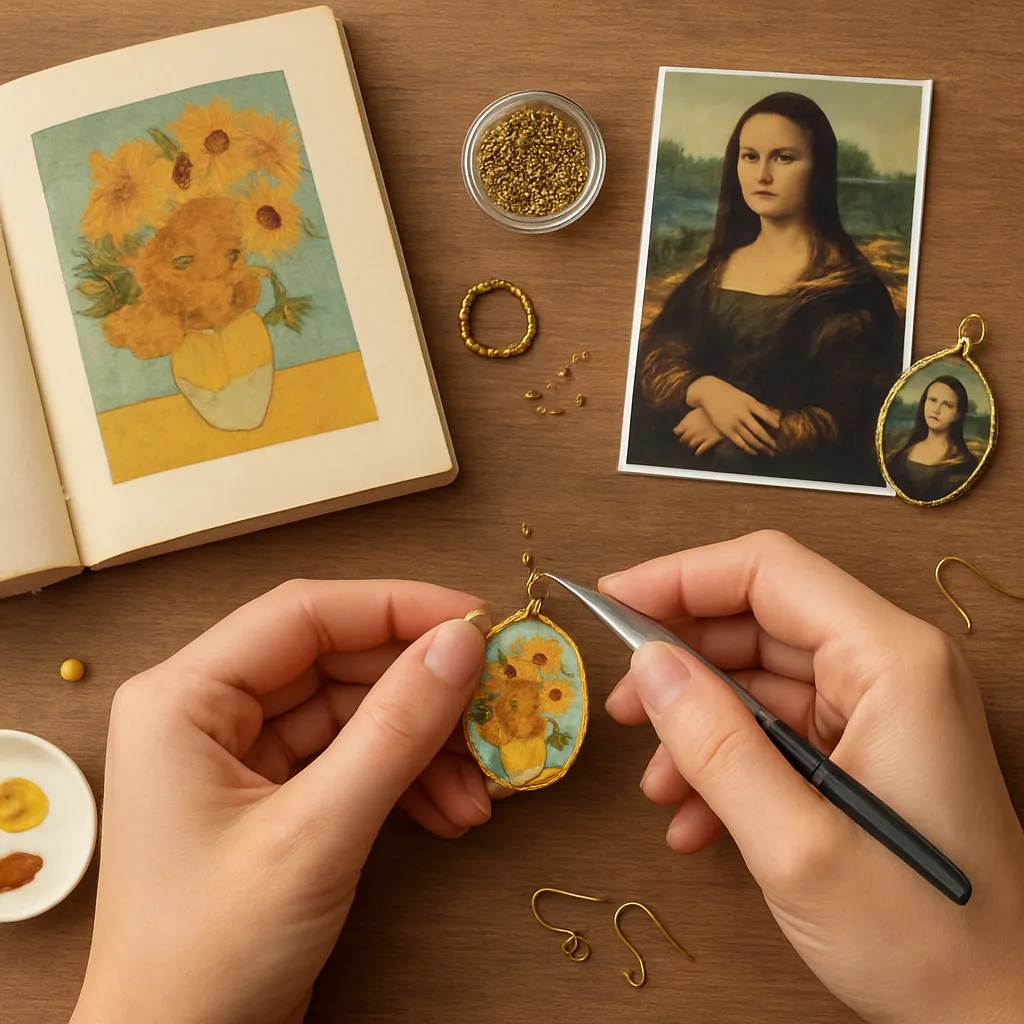
Art and adornment have always spoken to each other. When you translate a painting into jewelry, you’re not copying; you’re distilling color, rhythm, and gesture into metal, gem, glass, and fiber. The process invites slow looking, hands-on problem solving, and an intimate form of storytelling you can wear. This guide shows how to reimagine masterworks as rings, brooches, earrings, and necklaces—bridging the studio table and the museum wall with patience, curiosity, and cultivated craftsmanship.
Seeing Paint with Your Hands: From Canvas to Wearable Form
Before selecting tools or materials, learn to read a painting like a jeweler. Put aside the literal scene and look for structure. Paintings are built from relationships: color families, directional lines, clusters of value, and quiet passages that frame focal points. Your task is to convert those relationships into small-scale, durable, body-friendly objects.
- Color map: Squint until details blur. What three to five hues remain? Note their dominance and supporting roles. This informs your working palette of metals, stones, and surface finishes.
- Value and light: Where is the brightest accent? Where does the eye rest? Where are the low-contrast transitions? Identify a single high-value highlight to star in your piece.
- Line and rhythm: Trace the painting’s directional energy. Are there arcs, diagonals, or grids? Decide whether to express them as wire sweeps, bezel edges, or chain geometry.
- Weight and voids: Paintings balance masses of color against emptiness. In jewelry, voids are piercings, negative spaces, or open links that make a piece airy and comfortable.
- Texture memory: Take notes on smooth vs. impasto areas. Translate “brushy” passages with hammer planishing, fused granules, reticulation, or deliberately uneven vitreous enamel.
Some paintings lend themselves to literal micro-mosaics or miniature paintings beneath glass, while others are better reimagined abstractly—think triangles, rectangles, and primary colors (Piet Mondrian), or whiplash curves, spirals, and gold leaf shimmer (Gustav Klimt). Choose a target: a quietly suggestive brooch may say more than an overly faithful miniature. Always let body mechanics—edges, thickness, and weight—trump exactitude, because comfort is the first critique your piece must pass.
Color, Materials, and Finishes That Echo the Masters
Color is material in jewelry. You don’t have paint; you have metal alloys, stones, glazes, resins, glass, and fiber. Think beyond hue to permanence, reflectivity, and tactile response.
Metals as color fields
- Gold: Warm base notes for Klimt- or Byzantine-inspired work. Use high-karat for buttery saturation, or apply keum-boo (24k foil fused to fine silver) to introduce gilded motifs without casting.
- Silver: A cool, luminous ground akin to moonlit passages in nocturnes. Oxidize to deepen shadows or highlight engraving cuts.
- Copper and bronze: Earthy reds and browns for autumnal palettes and antiquity cues; they take a richly variegated patina.
- Steel: Graphite-like neutrality, excellent for stark, modernist interpretations; protect with wax or lacquer.
Glass, stone, and ceramic accents
- Transparent enamels over textured metal mimic glazed paint layers and depth. Opaques give flat, graphic blocks—ideal for grid compositions.
- Semi-precious stones supply stable color: lapis (deep ultramarine), carnelian (warm orange), malachite (banded green), amethyst (violet), onyx (black). Their polish influences how light moves in your piece.
- Vitreous beads, micro-mosaic tesserae, and lampwork elements capture pointillist sparkle in a durable, miniaturized form.
Surface and structure as meaning
- Finish: Matte surfaces “eat” light and feel velvety—great for atmospheric paintings. Polished planes act as highlights but can overpower small pieces; use sparingly.
- Mark-making: Light chasing, burr texturing, or planishing simulates brushstroke texture. Keep tool marks deliberate and directional to echo painterly rhythm.
- Edges: Crisp chamfers read modernist; softened radii echo organic, Art Nouveau sensibilities.
Jewelry’s color language must be anchored in wearability. Where a painter can layer glazes, a jeweler must anticipate abrasion, skin oils, and light exposure. Varnish-yellowing is a painting problem; tarnish is a jewelry problem. Choosing an alloy or patination system that will age gracefully is part of your design—your own controlled contrast between fresh and time-worn surfaces.
Techniques: Craft Toolkits for Painterly Effects
The technique you choose is the grammar of your translation. Mix media thoughtfully, but let one technique lead so the piece reads clearly at arm’s length.
Bead weaving and loom work for pointillism and pixels
- Use cylinder beads (size 11/0) on a loom to render crisp grids; peyote stitch for soft, diagonal edges that feel more “brushy.”
- Plan a reduced color chart (four to six hues) to preserve legibility at jewelry scale.
- Edge-stitch and back a wide bead panel with ultrasuede or thin leather to protect threads.
Wire drawing, fabrication, and soldering for line and flow
- Forge square wire into ribbon-like curves to express Art Nouveau lines. Solder intersections minimally to preserve spring and liveliness.
- Use pierced sheet (20–24 gauge) to create negative-space motifs; refine with needle files so the “drawn” edge is clean.
- Ball-up fine silver wire tips with a torch to suggest starry accents or seed clusters.
Vitreous enamel for luminous color planes
- Cloisonné: Form thin wire cells that mirror a painting’s contour map, then wet-pack transparent enamels for stained-glass depth.
- Basse-taille: Carve or chase patterns into metal and cover with transparent enamels; the relief creates internal light play.
- Sgraffito: Lay a contrasting layer and scratch designs before firing to emulate scratchy, expressive lines.
Polymer clay, caning, and millefiori for painterly blends
- Build color gradients by stacking tinted sheets, then slice ultra-thin veneers for seamless blends reminiscent of sfumato.
- Impress textures with fine sandpaper, fabric, or carving tools to break up specular highlights.
- Cure at controlled temperature to prevent color shift; finish with micromesh sanding for satin glow.
Resin and image transfer for miniature tableaux
- Encapsulate archival prints beneath domed resin in bezel cups. Seal edges meticulously to prevent bleed.
- Tint clear resin with transparent dyes to harmonize color casts across mixed imagery.
- Use UV resin for spot-fixes; two-part epoxies for thicker pours. Degas or warm gently to release bubbles.
Micro-mosaic and pietra dura for durable detail
- Set glass filati or stone slivers in a wax or cement bed; pack tightly to minimize grout lines that can visually “pixelate” the image.
- Reserve intense chroma for focal swirls or highlights; keep surrounding fields slightly desaturated.
Textile and metal hybrid approaches
- Embroider small painterly vignettes on silk, then bezel-mount under crystal. Incorporate couched gold thread to nod to gilded canvases.
- Fuse felted wool to backplates for soft micro-reliefs—comfortable on skin and visually akin to velour paint passages.
Safety note: Soldering, enamel firing, patination, and resin use demand ventilation and proper PPE. Mind thermal shock in enamels, avoid lead-bearing products when food-contact is possible, and dispose of pickle and solvents responsibly.
Project Walkthroughs Inspired by Iconic Works
These four projects model a repeatable workflow: observe, reduce, prototype, refine, and finish. Adapt dimensions to your or your client’s comfort.
Starry Night Micro-Mosaic Earrings (after Van Gogh)
- Scale: 22–25 mm ovals; keep each earring under 6 g for all-day wear.
- Base: Fabricate fine silver oval bezels with a shallow well (~1 mm) and a narrow rim.
- Color plan: Three blues (deep, mid, cyan), lemon yellow, cream, a touch of black. Reserve yellow for two or three starlets only.
- Tesserae: Pull lampwork filati or nip millefiori slices into curved slivers. Sort by value.
- Set: Butter the well with mastic or setting cement. Lay crescent swirls first (directional arcs), then inlay negative-space blues. Place micro-yellow stars last.
- Grout: Minimal. You want glass-on-glass continuity. Clean edges and burnish the bezel lip gently.
- Finish: Patinate the silver lightly to cool the frame; polish only the rim for a moonlit glint.
Primary Rhythm Pendant (after Mondrian)
- Scale: 35–40 mm square pendant.
- Base: Sterling frame with soldered internal bars to create asymmetrical rectangles.
- Color: Opaque enamels—cadmium red hue, ultramarine, primary yellow, plus white and black. Fire in separate cells for clean boundaries.
- Strategy: Leave two cells as brushed silver to “breathe.” Keep red area smallest but most saturated to anchor visual weight.
- Chain: Fabricate a bar-and-link chain that echoes the grid without competing with the pendant.
Golden Spiral Brooch (after Klimt’s Tree of Life)
- Scale: 55–65 mm brooch to showcase scrollwork.
- Base: Bronze backplate; overlay 24k keum-boo spirals and triangles for sparkle. Chisel texture between motifs for low-relief shimmer.
- Accents: Tiny cabochons (onyx, carnelian) in tube settings as “fruit” on branches.
- Surface: Matte-brush the background; high-polish the gold triangles for jewel-like pop. Pin back with double clutch for stability on fabric.
Wave Cuff (after Hokusai’s Great Wave)
- Scale: 30–35 mm wide cuff, 1.2–1.5 mm thick sterling or shibuichi.
- Method: Chase wave contours from the front, then repoussé from the back to raise swells. Pierced foam at the crest creates froth.
- Finish: Selective darkening in troughs, satin tops on ridges. A single bezel-set moonstone near the horizon supplies cool glow.
- Fit: Oval the cuff to wrist shape; round cuffs tend to rotate. Deburr edges thoroughly for comfort.
A Practical Workflow: From Sketch to Finish
- Study: Print your reference painting in grayscale and color. Mark zones of high and low value; circle the single brightest highlight.
- Reduction: Create a 3–5 shape “alphabet” from the painting’s geometry. These shapes drive piercings, bezels, or enamel cells.
- Material audition: Lay out swatches—metal chips with different finishes, stones, enamel chips, thread samples. Build a small mood board.
- Prototype: Make paper or thin-brass maquettes to test size, hinge points, and articulation. Evaluate comfort, snag risk, and balance.
- Fabricate: Commit to clean joins and heat control. Keep solder seams where paint “seams” would exist—edges that the eye already accepts.
- Finish: Stage your abrasives: 400 > 800 > 1200 grit; matte or polish deliberately. Over-finished surfaces can erase the painterly soul.
- Evaluate: Wear-test for a day. Note swing of earrings, rotation of pendants, and fingerprint visibility. Adjust textures accordingly.
Engineering Wearability: Anatomy of Comfortable Art
Great translation fails if it irritates the wearer. Jewelry is a kinetic object interacting with skin, hair, and fabric. Design for ease:
- Weight budget: Earrings under ~7 g per ear; pendants counterbalanced to avoid flipping; brooches with two pins to prevent droop on knits.
- Edge culture: Break all edges. A 0.25 mm bevel feels luxurious; a sharp arris feels unfinished and snags fibers.
- Articulation: Insert tiny hinges or jump rings between rigid elements so pieces drape with the body’s arcs, not against them.
- Back-of-piece honesty: Sand, seal, and smooth the reverse. The unseen surfaces are where the wearer decides quality.
- Clasp logic: Use toggles for stiff necklaces, magnetic clasps for dexterity needs (with safety chain), and sturdy pin mechanisms for weighty brooches.
Intellectual Respect: Inspiration, Reference, and Rights
Drawing inspiration from historical paintings can be both lawful and respectful when you translate rather than duplicate. Many iconic works (e.g., by Van Gogh, Monet, Klimt, Hokusai) are in the public domain, but modern reproductions, photography, and certain artists are still protected in many jurisdictions. Keep your work interpretive: transform composition, scale, and medium. If you directly reproduce imagery (e.g., printing and encapsulating), ensure you have permission or use verified public-domain sources. Credit your inspirations in captions and product descriptions; it builds trust and places your work in a cultural conversation.
Color Discipline: Keeping Harmony at Jewelry Scale
At small scale, too many hues can dissolve into noise. Limit yourself to five core colors and two neutrals. Build harmony via temperature (warm vs. cool), saturation (vivid vs. muted), and value (light vs. dark). The old painter’s rule—change one dimension at a time—serves jewelers well: if you shift to a cooler blue, keep saturation and value consistent to avoid muddying your scheme. Place the brightest accent far from the mass center to animate the composition—think of it as a single, carefully set gem acting as a focal spark.
Texture as Time: Making Surfaces That Age Beautifully
Surfaces tell a story even after the first week of wear. Choose textures and finishes that accumulate character rather than fight it. A hairline-brushed band hides micro-scratches; hammered facets diffuse light; sealed patinas evolve slowly. Intentionally contrast zones that will polish with wear against deep recesses that keep their shadow, so your piece writes its own history on the body. This is where proportion matters: a small band of high polish adjacent to a broader matte field creates legible, long-term dynamism.
Studio Notebook: Documenting Your Process
Keep a maker’s log for each piece: enamel firing temps and times, alloy batch numbers, patination formulas, adhesive brands, sketch iterations, and measured drawings. Photograph prototypes and final pieces under consistent light. The practice yields repeatability and helps diagnose issues later. Good notes offer commercial power as well—clients love peeks behind the curtain, and galleries value clear provenance and material details. Treat each project as an archival record you can build on.
Tool and Material Shortlist for Painting-Inspired Work
- Metal: Fine silver, sterling, copper, bronze; 20–26 ga sheet; assorted wire (round, square, half-round).
- Heat: Soldering torch, firescale control (boric/alcohol dip), pickle pot, third hands, charcoal or solderite blocks.
- Forming: Hammers (planish, emboss), dapping set, stakes, chasing tools, pitch bowl.
- Surface: Needle files, gravers, abrasive papers to 2000 grit, radial bristle disks, texturing burs.
- Color: Enamels (opaque and transparent), kiln or torch, mesh trivets; or resin, UV lamp, tints.
- Detail: Beads, micro-mosaic filati, lapidary offcuts; fine brushes; micro tweezers.
- Safety: Eye protection, respirator for dust/fumes as needed, fume extraction, nitrile gloves.
Sustainability and Thoughtful Sourcing
Bringing paintings into the present includes honoring materials. Recycled precious metals and conflict-free or lab-grown stones reduce footprint while broadening color options. Repurpose studio scrap into small inlays or granules. Favor long-lived finishes over temporary coatings. Package work in reusable, acid-free boxes and send care guides to help clients steward the piece for decades. A mindful supply chain deepens the story your jewelry tells.
Presentation: Naming, Narratives, and Display
Titles and cards help audiences see what you saw. Instead of declaring a copy, write notes like “Pendant after the evening blues of a Provence sky” or “Brooch inspired by the spirals of a Secessionist tree.” Display works with swatches of materials and a thumbnail of the referenced painting when permissible. On the body, ensure the piece faces forward naturally; a slightly weighted bail or an off-center pin stem can correct unwanted rotation. Invite touch—texture is a bridge between viewer and wearer.
Care and Maintenance for Color-Rich Pieces
- Metal: Store silver in anti-tarnish pouches; refresh matte with Scotch-Brite rather than aggressive polishing.
- Enamel and glass: Avoid hard knocks; clean with mild soap and a soft brush. Never use ultrasonic cleaners on micro-mosaic or enamel.
- Resin: Keep away from solvents and prolonged UV; buff light scratches with plastic polish.
- Textiles: Spot-clean, avoid perfumes or hairsprays; add removable backs for laundering garments without removing embellishment.
Troubleshooting Common Issues
- Color muddiness: Too many near-equal saturations. Solution: Desaturate the background and reserve chroma for the focal note.
- Flipping pendants: Bail too high or center of mass misaligned. Solution: Lower attachment point or widen bail to increase contact.
- Earring fatigue: Excess weight or poor leverage. Solution: Switch to hollow-formed elements, reduce length, or use leverbacks.
- Enamel crawling: Inadequate cleaning or oils. Solution: Degrease with hot water and detergent; pre-fire base coat thinly.
- Resin bubbles: Entrained air. Solution: Warm components gently, mix slowly, or pressure-cure; pass flame quickly over surface.
- Patchy patina: Uneven surface prep. Solution: Uniformly abrade, degrease, apply patina in controlled passes, and seal consistently.
Developing Your Signature Idiom
Over time, you’ll build a personal lexicon: a certain hammered mark that whispers of brushwork, a recurring spiral, a color triad you return to. Let the paintings you love be mile markers, not destinations. Revisit them as your hands change. Alternate precision with play—some days script cloisonné grids with the rigor of De Stijl; other days improvise with fused scrap to echo gestural abstraction. The goal is not mimicry but recognition: that someone who has stood before a masterwork can feel the same pause, the same inhale, when they hold your piece up to the light.
A Short Exercise Series for Sharper Seeing
- Five-shape reduction: Choose any painting and limit your sketch to five flat shapes. Build a cardboard brooch from these shapes and pin it to a jacket. What reads at two meters? Keep only that.
- Value-only study: Craft a pendant in three metals (silver, shibuichi, patinated copper) with no color stones. Let value contrasts carry the design.
- One-tool texture: For an hour, use only a ball-peen hammer to study how angle and force shift surface readings from mist to torrent.
- Silent color: Make earrings in a single hue with three finishes—mirror, satin, sandblasted—to learn how finish masquerades as hue change.
Closing Notes on Form and Feeling
Jewelry condenses a painting’s atmosphere into grams and millimeters. Success depends on knowing which qualities to keep and which to let go. Trust your eye for composition, your hand for edges and joins, and your sensitivity to the small dramas of light and shadow. Attend to scale and silhouette, honor the body’s curves, and let materials speak. Returning to the same source across seasons will reveal new entrances: a cooler blue, a quieter gloss, a better curve. That iterative discipline—tempered by curiosity—will keep your work alive long after the clasp clicks shut.
Quick Reference: Ten Words to Remember — palette, composition, texture, enamel, patina, proportion, silhouette, archival, contrast, craftsmanship. Keep them close; use them as check points at sketch, prototype, and finish stages. When each is addressed with intention, your jewelry won’t just resemble a painting—it will carry its breath.
