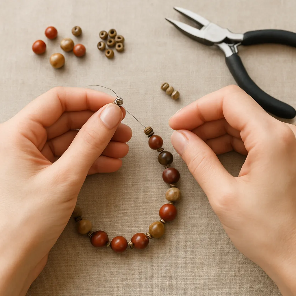
Designs that feel calm, readable, and elegant owe much of their grace to the air between parts. In handicraft, a spacer is not just a filler; it is a tiny instrument that sets tempo, distributes weight, and lets colors, textures, and forms breathe. Whether you string beads, stitch quilts, knot macramé, weave bands, cut leather, or assemble wooden inlay, using spacers with intention can transform a busy layout into a poised composition that wears comfortably, photographs beautifully, and ages well.
Why Spacers Matter: The Language of Space
Spacers make absence visible. By separating elements at regular or meaningful intervals, you give the eye a path to follow. This path defines focal points and clarifies relationships among shapes. A statement bead glows brighter when a slim tube bead steps back to frame it. A quilt’s bold star reads cleaner when narrow sashing bars prevent visual collisions between blocks. And a leather strap with crisp keepers sits properly on the wrist because the holes, stitches, and edges respect one another’s territory.
At a practical level, spacers solve multiple problems at once:
- They distribute mass to prevent sagging, twisting, and uneven wear.
- They stabilize dimensions so components stay aligned during movement.
- They provide repeatable reference points for accurate cutting, stitching, or knotting.
- They slow down the composition, so the eye doesn’t rush and miss nuance.
At an artistic level, spacers help you achieve visual balance, control proportion, sustain rhythm, stage clear hierarchy, and, when desired, explore gentle symmetry. Treat them as you would any other design element; choose their size, material, and finish with care rather than defaulting to what’s on hand.
Types of Spacers Across Handicrafts
Spacers come in many forms—permanent, removable, rigid, flexible, decorative, or invisible. Here are common families you can adapt across crafts.
- Bead spacers: heishi disks, rondelles, seed beads, daisy spacers, smooth tubes, corrugated tubes, tiny cubes, micro rondelles, bead caps used back-to-back.
- Stringing and wirework aids: silicone or rubber tubing, crimp covers used as soft separators, jump rings repurposed as slim spacers, coiled wire spacers (helix springs).
- Sewing and quilting: sashing strips, coping strips, lattice, narrow borders, flying geese or half-square triangles used as rhythmic spacers, basting spacers (temporary card guides).
- Weaving and macramé: paper or dowel spacers to set sheds, plastic combs, knot-spacing boards, beads between rows, scrap yarn pick spacers that are later removed.
- Leather and bookbinding: keepers and loops, skived filler strips to even thickness, spacer cords for raised bands, gauged distance blocks for punch spacing.
- Wood, inlay, and marquetry: shim stock, veneer offcuts, card feeler gauges as layout spacers, tile spacers for mosaics, dowel spacers for glue-up consistency.
- Ceramics and glass: kiln stilts and setters, fiberboard or alumina spacers, wadding beads, tile spacers for mosaics and stained glass lead lines.
- Embroidery and lace: thread count spacing, waste thread spacers, bobbin lace pins and pricking patterns as spatial scaffolds, couching stitches at fixed counts.
When you think of a spacer, picture not only the physical piece that remains in the final work, but also the temporary jig that guides you during construction. A stack of two playing cards is an excellent instant shim. So are toothpicks taped together, a 3D-printed ring, or a slice of silicone tubing—humble tools that create consistent gaps you’ll feel and see.
Sizing Spacers: Systems That Keep You Honest
Choosing the right spacer size turns guesswork into a controlled experiment. Pick a sizing system before you start, and stick to it throughout the project.
- Even-step system: equal gaps everywhere, best for grid patterns and minimalist work. Example: 3 mm spacer between every major element.
- Ratio system: relate spacer size to feature size using simple ratios. A 1:2 or 2:3 spacer-to-feature ratio often produces pleasing calm. For tiny work, go finer: 1:4 or 1:5.
- Accent bias: thick spacer around focal points, thinner elsewhere. Use to stage entrances and exits in a bracelet or quilt.
- Progressive ladder: increase or decrease spacer width stepwise along a path to create motion—useful in macramé and beadwork ombré runs.
- Rule-of-thirds and golden relationships: place primary accents near thirds of the length; use approximately 0.618 as a multiplier for subtle tuning of gap sequences.
Measure materials in their working state. Cord diameter under tension is smaller than at rest; leather swells after burnishing; bead holes and facets add micro-gaps. For jewelry, verify outer diameter (OD) and inner diameter (ID) of spacers, and test thread or wire pass-throughs. In textiles, pre-wash sashing fabrics and measure after pressing to find true finish widths.
Planning and Prototyping
Spacers are tiny, but their accumulative effect can shift length by centimeters. A short prototype saves unpicking later.
- Sketch a spacing map: draw nodes (beads, blocks) and bars (spacers). Annotate sizes and counts.
- Build a 10–20% scale segment: string a small run or stitch a mini-block strip to confirm drape, thickness, and visual weight.
- Photograph in good light: black-and-white photos expose crowding better than color.
- Wear or hang test: for bracelets and pendants, let gravity and body heat reveal flaws; for quilts, pin to a wall and step back 2–3 meters.
- Record exact counts: “8 repeats of [2 seed beads + 1 rondelle] between features” is more reliable than “about a finger’s width.”
Material Choices and How They Behave
Different spacer materials change both aesthetics and mechanics.
- Metals (sterling, brass, copper, stainless): crisp edges, defined shadows, strong wear. Plated varieties are economical but may show base metal at friction points.
- Glass and crystal: light-catching and color-stable, but heavier; use sparingly to avoid droop.
- Wood and bone: warm tactility with low weight; protect with wax or finish to resist skin oils and moisture.
- Rubber and silicone: compressible, great for shock absorption and to quiet jingling on metal-heavy designs.
- Textiles and leather: soft separators that add cozy volume; mind fray, stretch, and dye transfer.
- Ceramic and porcelain: sculptural presence; place soft buffers (felt, silicone) near closures to prevent chipping.
Match spacer hardness to neighbor components: hard-on-hard yields sharp articulation; soft-on-hard dampens sound and movement. For color, neutral spacers (matte black, pewter, off-white) recede; high-contrast spacers punctuate like commas in a sentence.
Techniques by Craft
Jewelry Stringing and Wirework
For a bracelet that reads refined rather than crowded, plan a base rhythm—say, 3 mm round metal spacers between 6 mm gemstone beads. Add mild asymmetry by inserting a 5 mm tube spacer on each side of the focal bead. Use bead boards with measured channels to pre-visualize lengths. For flexible wire (49-strand) and crimps, place micro spacers next to the clasp to reduce metal-on-metal wear. If using memory wire, keep spacer OD consistent to avoid kinks. Press crimps with proper pliers; a crushed crimp that bites into a spacer edge becomes a failure point.
Wire wrapping offers sculptural spacing. Coil a 20–22 gauge wire around a mandrel to form even helical spacers. Oxidize and polish to highlight ridges. For stacked pendants, add small jump rings as micro-gap holders that keep charms from scraping each other. Always test drape: place the unfinished piece on a velvet tray, tilt it, and watch how components slide and stop.
Macramé and Micro-macramé
Spacing in macramé is about knot count and cord diameter. Decide that “two square knots equal one spacer” and maintain that cadence. To insert beads as spacers, slide them onto filler cords and secure with half-hitches on either side to lock position. Use a foam board marked in centimeters, or a printed grid under glass for reusability. When cords swell after waxing, reduce planned spacer counts by one per 10–15 cm to keep the net length stable. For micro-macramé, work under magnification so micro-spacers don’t disappear visually.
Quilting and Patchwork
Sashing is the quilter’s spacer. Narrow strips, often 1.5–2.5 inches finished, separate blocks so motifs read distinctly. Press seams toward the sashing to create a subtle ridge that frames blocks. If blocks vary slightly in size, add coping strips—thin buffers that true the layout before final joining. Bindings can function as perimeter spacers: a slim binding lets the interior dominate; a wide binding provides a restful border. For improv quilting, stagger spacer widths to create offbeat rhythm while still granting the eye predictable resting places.
Weaving, Bands, and Tablet Work
In weaving, temporary spacers preserve sheds and keep selvedges honest. Paper strips or thin dowels inserted at the start of weaving help spread the warp to its planned width. For Baltic pick-up bands, count pattern picks and insert a neutral-color weft pick as a spacer every set interval to reset your hand and tension. In tablet weaving, leave one “empty” turn per sequence to prevent over-dense visuals; that empty turn is a deliberate spacer encoded in the draft.
Leatherwork and Bookbinding
Even spacing is the soul of handsome leather goods. Use pricking irons matched to thread diameter so stitch spacing complements stitch bulk. Edge creasers and overstitch wheels act as visual spacers from the edge line. Inside straps, skive thin leather strips as fillers where hardware would otherwise create bulges; these hidden spacers even out surfaces for better burnishing and a comfortable wear. In binding, raised bands on the spine are defined by cords acting as spacers; consistent gaps between bands produce a dignified cadence down the book’s back.
Color, Texture, and Visual Weight
Not all spacers must be neutral. A strategic line of matte hematite beads cools a warm gemstone palette. Brushed brass tubes inject quiet shine compared to mirror-polish, which steals the scene. Texture functions as a spatial tool: corrugations and faceting cast shadows that read as micro-gaps. In textiles, a shot-cotton sashing shifts color with angle, creating gentle separators without harsh contrast. In wood inlay, a thin ebony or maple line gives crisp definition when adjacent colors are similar.
Jigs, Templates, and Measurement
Consistency starts with tools that do not lie. Keep a set of calipers for beads and tubes; a seam gauge and rulers for fabric; feeler gauges and card shims for wood and leather. Build simple jigs:
- Spacer ladders: thread known-size beads or tubes between knots on a reference cord; lay it next to your work to check spacing on the fly.
- Template strips: cut cardstock with marked increments (5, 8, 10 mm). Pierce holes at marks to quickly place stitches or eyelets.
- Stop blocks: wood or acrylic blocks clamped to a table to set repeat distances for punching or riveting.
- Photo grid: a printed centimeter grid under a clear mat so you can align work while taking progress photos.
Label everything. A tin marked “3 mm tubes” that secretly holds 2.5 mm will undo hours of planning. Add a test string inside each container to confirm fit with favorite cords or wires.
Repetition, Rhythm, and Variation
A good spacer strategy gives your piece a heartbeat. Repetition invites comfort; variation keeps attention. One approach: maintain a consistent small spacer everywhere, and swap in a special spacer at predictable waypoints—every fourth repeat, near the clasp, at the quilt’s corners. Another approach: use a spacer gradient that thickens toward the focal zone, then thins again to release the eye. In wood mosaic, alternate tile spacers of 1 mm and 2 mm to create syncopation; seal carefully to prevent finish from pooling in wider gaps.
Tension, Drape, and Movement
Spacers are only as effective as the forces acting around them. In stringing, a cord pulled too tight turns soft spacers into wedges that crush softer beads; too loose and gaps open randomly. Aim for baseline tension that allows each spacer to seat gently without buckling. In textiles, steam-block knitted or crocheted pieces to their final measurements before joining with spacer strips; drape changes dramatically after blocking. In weaving, pack weft lightly when using decorative spacer picks; over-beating erases the very gaps you meant to celebrate.
Durability and Maintenance
Longevity is a design parameter. Plated spacers near clasps and rings wear faster from friction; tuck a rubber or silicone buffer near metal-on-metal points. For stretch bracelets, choose spacers with smooth inner bores to reduce abrasion on elastic. In quilts, pre-test spacer sashing fabric for colorfastness, especially when adjacent to light fabrics; a bleeding spacer line will migrate like a shadow. In leather, beeswax and burnishing create compression; expect space to tighten by a fraction and size accordingly.
Troubleshooting Common Spacing Problems
- Piece looks busy: increase spacer size by one step, or reduce the number of accents. Try matte spacers to quiet reflections.
- Bracelet kinks at the focal: add two slim spacers flanking the heaviest element; switch to a softer cord or add a tiny swivel component.
- Quilt blocks don’t line up: insert coping spacers; square each unit before final sashing; press seams consistently.
- Knotwork creeps unevenly: mark a centerline on your board; place temporary pin spacers every 2–3 cm; wax cords evenly.
- Finish pools in mosaic gaps: seal once lightly, let cure, then grout or finish; use thin viscosity sealers near narrow spacers.
Sustainability and Upcycling Spacers
Spacers can be earth-friendly. Repurpose:
- Tiny washers, trimmed straws, or bamboo skewers for structural spacing in tools and jigs.
- Veneer scraps as elegant wood line spacers in boxes and frames.
- Felt offcuts to pad and separate ceramic or glass elements.
- Discarded jump rings straightened and re-coiled into heishi-like coils.
When upcycling metal, test for magnetism, corrosion, and skin reactions. When reusing plastics, avoid solvents or finishes that might degrade them. Seal porous organic spacers to prevent sweat absorption.
Advanced Ideas: Systems Thinking for Spacers
Think in modules instead of one-off decisions. Establish a design kit: a base spacer size, a half-step size, a double size, plus one special accent spacer. This kit travels across collections for instant cohesion. Document exact counts for small, medium, and large bracelets; lap quilts and throws; narrow and wide straps. A modular kit amplifies modularity and encourages repeatability when you scale up production or revisit a series months later.
For pattern exploration, map spacer sequences as strings of numbers: 1-1-2-1-1-3 describes relative spacer widths. Build a deck of sequence cards; shuffle to discover viable rhythms, then prototype the promising ones. Digital crafters can parameterize spacers in vector or CAD templates, then print or cut jigs that guarantee exact distances.
Working Comfort: Ergonomics and Flow
Comfort multiplies quality. Elevate your work surface so your wrists stay neutral while placing small spacers. Use trays with lips to corral tiny parts; add nonslip mats. Pre-sort spacers by size into labeled wells. Keep a lint roller nearby to catch runaways. Good light is crucial: a daylight lamp angled to rake across your work reveals uneven heights and shadow gaps that flat lighting hides.
Finishing Touches: Sealing the Space
The last steps lock your intentions. In jewelry, slide components tightly together while the piece is flat, then let it hang and settle before final crimps or knots; this simulates real wear. Add a dab of flexible adhesive inside a final knot to stabilize spacing over time. In quilts, stitch-in-the-ditch along sashing or echo quilt around motifs; this quilting treats spaces as shapes in their own right. In leather, edge paint or burnish spacers to the same sheen as their neighbors; differences in gloss can read as accidental spacing errors.
Common Myths About Spacers
- Myth: Spacers are just fillers. Reality: They are active design elements shaping sightlines and comfort.
- Myth: More ornament beats more space. Reality: Empty space heightens the preciousness of what remains.
- Myth: Perfect symmetry is always best. Reality: Slight asymmetry with consistent spacing often feels more human and alive.
- Myth: Only premium spacers look good. Reality: Modest materials, well-sized and well-placed, look refined.
Quick Recipes to Try
- Calm gemstone bracelet: 6 mm round stones, 3 mm brushed brass tubes every bead, 5 mm tubes flanking the focal, micro silicon spacer next to the clasp.
- Modern lattice quilt: 12-inch blocks with 1.75-inch finished sashing in cool gray; cornerstones in a slightly darker gray to anchor intersections.
- Macramé plant hanger: groups of square knots separated by two half-hitches and a 10 mm wooden bead every third section for cadence.
- Leather key fob: stitch line 3.5 mm from edge using pricking iron spacing; add a 1 mm leather filler under the hardware to keep the strap uniformly thick.
- Mosaic trivet: 20 mm tiles with alternating 1 mm and 2 mm tile spacers; seal twice before grouting for crisp, controlled gaps.
Practice Drills for a Sharper Eye
- Spacing ladder: string a 15 cm ladder alternating 2, 3, 4 mm spacers; photograph from 1 m, then 3 m; note where rhythm feels right.
- Value study: assemble a monochrome bracelet or fabric strip set using only light-to-dark shifts; see how space alone organizes the design.
- Speed constraint: make three prototypes in 30 minutes with fixed spacer kits; compare which one breathes best despite time pressure.
- Silent critique: tape your work to a wall overnight; look at it fresh in the morning. If your eyes relax at first glance, your spaces are working.
From Intuition to Intent
Most crafters already use spacers intuitively. The leap is to make those instincts explicit: write down counts, establish ratios, and reflect on what your eye seeks. Over time, your choices become a personal spacing dialect that repeats across necklaces, quilts, and leather goods. Consistency need not mean uniformity; rather, it means clarity about where you tighten or loosen the visual screw to guide attention with grace.
When you treat space as a material—measured, shaped, and finished—you design with greater confidence. You’ll notice how steady spacing elevates a simple bead string, how a narrow border steadies a riot of prints, and how a trim leather keeper can tame the loudest buckle. The reward is work that looks intentional from across the room and delightful up close, alive with considered gaps that let form and color sing.
Carry a small kit of preferred spacers, a ruler or calipers, and a reference ladder. With these, you can prototype anywhere: at a market stall, in a studio, or at a kitchen table. Keep your eye on the way light pools in the spaces you’ve designed, and refine until the piece moves with quiet confidence. That is how spacers help you build designs that are legible, graceful, and enduring—designs that honor time, material, and your growing craftsmanship.
