An ombre is more than a color fade; it’s a journey across hues, light, and texture that turns functional jewelry into a small landscape of color. When translated into beaded design, an ombre can feel like the sky at dawn, a shoreline, or the slow shift of leaves in autumn. Whether you stitch or string, the secret is a controlled gradient that looks effortless, wears comfortably, and holds up to everyday use. This guide explores color theory, planning, and practical methods for building fluid fades in bracelets, necklaces, earrings, and bead embroidery, with detailed tips to help you achieve professional results at home.
Why Ombre Works So Well in Beaded Designs
Beads are tiny points of light. Each one reflects or absorbs illumination, creating sparkle, shadow, and a sense of motion—especially when arranged in tonal progression. An ombre sequence unifies these points into a visual flow that flatters the curve of a wrist, the angle of a collarbone, or the swing of a tassel. Instead of a single focal bead, an ombre becomes the focal rhythm of the entire piece.
Ombre designs also solve common color challenges. Unsure how to combine blue and green without clashing? Fade them. Want to tone down a neon without losing its energy? Surround it with midtones. Need elegance from very simple stitches? A carefully built transition transforms a basic strip of beads into something sculptural and dynamic.
In short, ombre beadwork is accessible to beginners yet endlessly flexible for experienced makers. With the right approach, it’s also repeatable, so you can restock a successful design or adapt it into sets that coordinate beautifully.
Color Theory for Bead Ombre: Seeing Beyond the Swatch
To build smooth shifts, focus on three pillars: hue, saturation, and value. Hue is the basic color family (red, blue, green). Saturation is intensity (pure vs. muted). Value is lightness or darkness. You’ll also consider surface qualities: finish, texture, and opacity.
- Hue shifts: Move around the color wheel—e.g., teal to blue to violet. This tends to look dramatic.
- Value shifts: Keep the hue the same but go from pale to dark (or vice versa). This is the most classic ombre.
- Saturation shifts: Desaturate a bright color by mixing in gray-toned beads or by stepping into smoky matte finishes to calm the intensity.
- Finish shifts: Metallics, matte, luster, AB (Aurora Borealis), ceylon, and transparent coatings can refine or disrupt a transition. Finishes with similar reflectivity usually blend more smoothly.
For the most forgiving transitions, keep at least two of the three pillars stable. Example: if you shift hue (teal → blue), keep value and finish close to constant; the fade will look more seamless. If you shift value (light → dark), keep hue and finish consistent to avoid choppy steps.
Planning Palettes: From Idea to Bead Tray
Great ombre starts before the first stitch. Invest extra time in palette planning and your hands will fly through the execution.
Build a Test Line
Lay out a single-file sequence of seed beads in the exact order of your intended fade. Use a white card or bead mat and view the line under multiple lights (daylight, warm lamp, diffused shade). Squint to evaluate whether the transition looks fluid. If a jump feels harsh, add one or two bridging colors or swap a bead finish that matches reflectivity better.
Count Ratios, Not Just Colors
An ombre is not just A-B-C-D in equal blocks. It’s a series of ratios. For each step, determine how much of each bead to use. A simple approach:
- Start color (S): 100% in the first segment, then 75%, 50%, 25%, 0% over subsequent segments.
- Bridge color (B1): 0%, 25%, 50%, 75%, 100%, then 75%, 50%…
- End color (E): Introduce late, ramp to dominance.
Adjust the number of segments for the length of your piece. Wider bracelets and long necklaces need more bridging steps; delicate earrings may only need three.
Sourcing Consistency
If possible, buy a few grams more than you think you need, and stick to one brand per size for consistency in hole size and bead uniformity. Size 11/0 seed beads can vary subtly: some brands run slightly taller or wider, which can interrupt the smoothness of a fade.
Bead Types, Sizes, and Finishes That Enhance Ombre
Uniform beads simplify transitions. Cylinder-style seed beads (often called delicas) give the sharpest pixel-like read, while round seeds add organic sparkle. Delicas are fantastic for graphical value fades; round seeds glow for painterly gradients.
- Sizes: 11/0 is versatile for bracelets and earrings; 15/0 is excellent for micro-blends and soft edges; 8/0 suits bold statements and quick projects.
- Finishes: Matte beads soften shifts; shiny or metallics increase perceived contrast. Combining matte and metallic can create beautiful “breathing” effects in the fade.
- Transparency: Transparent and semi-transparent beads diffuse light and can visually lighten a section. Opaque beads hold color shape and strengthen edges.
Note that translucent beads can appear lighter on skin and darker on white fabric. Always test against the intended background.
Stringing Techniques for Quick, Elegant Ombre
Stringing is the fastest way to create an ombre necklace or bracelet. The key is control—over ratios and length.
Materials Checklist
- Seed beads in 4–8 coordinated colors
- Beading wire (0.014–0.018 in) or strong nylon thread for softer drape
- Crimp beads/tubes, covers, and clasp
- Bead stoppers or tape
- Ruler and bead board
Method: Micro-Blended Strand
- Design your sequence on a bead board. Start with Color A dominating the first 2–4 cm.
- Introduce Color B at a 1:5 ratio with A. Every 5–8 beads, place 1 of B. Gradually shift to 1:3, then 1:1, then 3:1 in favor of B.
- If moving to Color C, repeat the same overlap method, keeping total bead counts per section proportional to the jewelry length.
- Thread beads, checking length on the body. Adjust micro-ratios if a junction falls at an awkward bend (e.g., wrist underside).
- Crimp and finish. For multi-strand pieces, vary start and end points of each strand so fades interlock rather than align identically.
Tip: For a bolder look, use small stacks of identical color (e.g., 3–5 beads) instead of singles, but maintain the same ratios to keep the fade smooth.
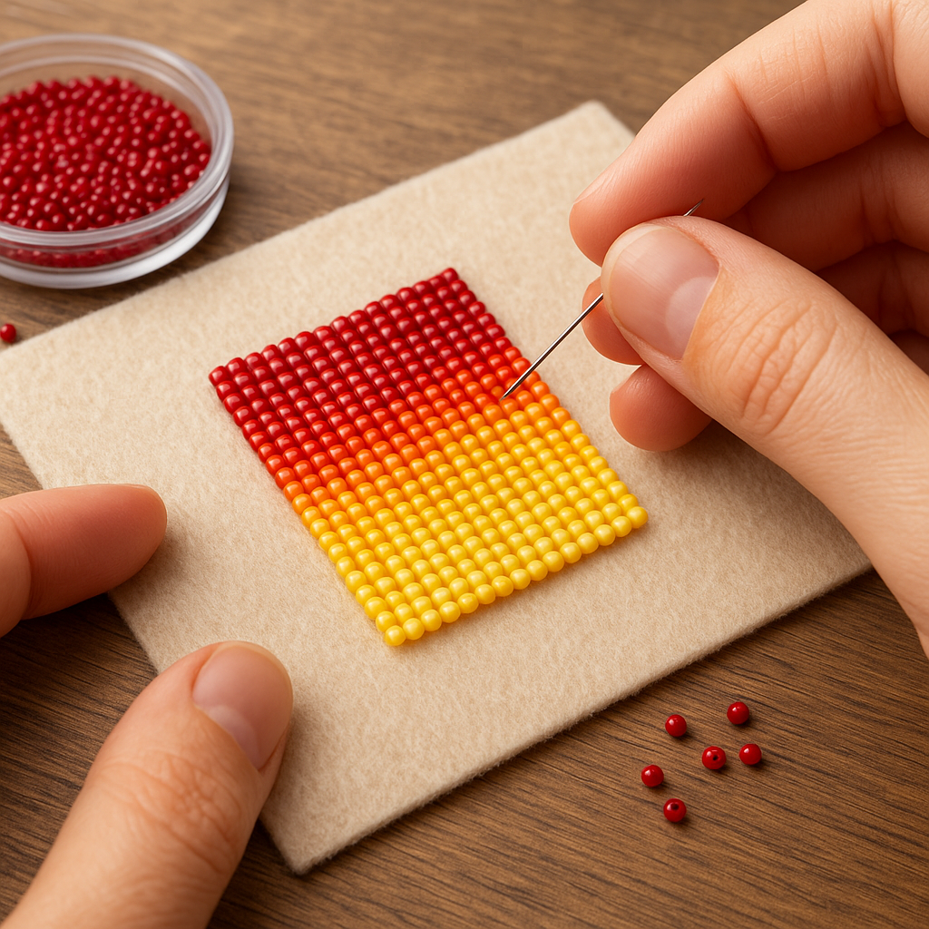
Weaving Ombre: Peyote, Brick, and Loom
Woven techniques shine for ombre because you can control each column or row. In even-count peyote, the “pixel” grid is especially predictable, making it easier to map a fade from light to dark.
Even-Count Peyote Gradient Bracelet (Beginner-Friendly)
- Size 11/0 cylinder beads in five values of the same hue
- Beading thread (nylon or poly) and beading needle
- Clasp, jump rings, and end tubes or beaded loops
- Foundation: Stitch a base strip 8–12 beads wide. Start with the lightest shade for 6–10 rows.
- Transition 1: Blend Light to Light-Medium by interspersing 10–20% of the next value across two rows, then 30–40%, 60–70%, and finally 80–100%.
- Transitions 2–4: Repeat for each subsequent value step until you reach the darkest shade.
- Edge Finish: Zip-stitch edges for stability or add a picot trim that echoes the darkest tone.
Brick stitch reads similarly to peyote but builds from a ladder, which can make starting a straight edge easier for some makers. Loom work produces perfectly aligned rows; if you love razor-sharp transitions or mirrored gradients, loom is a dream. Remember that loom warps add structure; consider a gentle taper of color near the clasp so the bracelet feels flexible where it needs to bend.
Bead Embroidery Ombre: Painting With Beads
In embroidery, fabric acts as your canvas. You can place beads in concentric arcs, scattered fields, or dense clusters that mimic watercolor washes.
Method: Radial Ombre Around a Cabochon
- Back the cabochon on stiff beading foundation and secure with a bezel row.
- From the bezel outward, stitch 2–3 rows of the main hue, then introduce the secondary hue at 10–20% scattered placement.
- Increase the secondary hue density in each subsequent row while reducing the primary. Drop in a third bridging color to avoid a hard ring.
- Finish with a border row in the last color to anchor the transition.
Use shorter thread paths when switching colors frequently. A small variety of bead sizes (11/0 plus a sprinkling of 15/0) helps hide stitch lines and creates a velvety fade.
Fringe, Tassels, and Dangles: Gravity-Assisted Gradients
Fringe is a natural ombre playground because each strand is a tiny timeline from top to bottom. Start every strand with your anchor color near the edge or bail, then slip into midtones, ending with the darkest beads to weight the tips.
- Consistency: Keep the first 1–2 beads at the top consistent across all strands to unify the piece.
- Rhythm: Vary strand lengths subtly for movement, but place the deepest color consistently near ends for a visual “hem.”
- Accent drops: Teardrops or dagger beads in the end color amplify the ombre’s punctuation point.
Beyond Color: Texture, Finish, and Bead Size as Gradient Tools
An ombre can shift not only color but also texture: matte to glossy, frosted to metallic, small to large. Keep one element constant while changing another to avoid visual chaos.
- Size fade: Start with 15/0 near a focal and step up to 11/0 or 8/0 away from it to imply distance or depth.
- Finish fade: Move from frosted matte to subtle luster, then to high-polish or metallic for a sunrise effect.
- Surface mix: Faceted crystals can punctuate a color transition if they share value with the surrounding beads.
When mixing textures, evaluate under different light temperatures. High-shine finishes can introduce unintended contrast, which can be beautiful or disruptive depending on your goal.
Advanced Ombre Concepts for Original Designs
Split-Gradient Necklaces
Instead of one continuous fade, build a center light area that graduates to darker tones at both ends. This frames the face and can make a necklace appear lighter in weight while still offering drama near the clasp.
Hue-and-Value Crossfade
Shift hue in one direction while shifting value in the other—for example, lighter teal to darker violet. Keep finishes identical to prevent jittery transitions. This works best over longer lengths where you have space to manage intermediate steps.
Opposing Ombre Earrings
Let one earring run light-to-dark and the other dark-to-light, so the pair reads as a single wave when worn. Mirror your ratios exactly for a composed, intentional look.
Skin-Tone and Wardrobe Awareness
Translucent beads, pearls, and lusters change character against different complexions or fabrics. If designing to sell, photograph on multiple backgrounds to demonstrate versatility and help customers choose the fade that suits them.
Thread, Tension, and Construction Details That Keep Ombre Smooth
Clean execution matters as much as color. Use a fresh needle and a thread weight that suits your bead size and stitch. Calibrate tension to lie flat but not stiff; a too-tight strip can distort spacing and break the visual flow. Consider:
- Thread choice: Bonded nylon or poly works well for repetitive passes; wax lightly for control without gumming high-gloss beads.
- Edge management: Neat edges frame your ombre. Add a reinforcing row at transitions to keep columns aligned.
- Clasp transitions: Taper value or bead size near clasps for flexibility. Hardware bulk can visually “cut” a fade if you end on a sharp color contrast.
Color bleeding is rare with quality beads but test anything heavily dyed. If a color is questionable, reserve it for dangles or areas with fewer thread passes.
Brand and Sizing Nuances That Affect the Fade
Seed bead precision varies. Cylinders from brands like Miyuki are known for crisp uniformity and slightly different “hand” compared to other manufacturers. Even small differences in height or hole size affect how tightly beads pack, and thus how evenly your ombre reads across long stretches. If you must mix brands, cluster them in blocks rather than peppering together at a micro level, or use them in distinct regions of the fade to avoid texture flicker.
Step-by-Step Project: A 5-Value Ocean Ombre Cuff
This cuff moves from pale seafoam at the wrist edge to deep midnight blue at the center, then returns to seafoam at the opposite edge.
Materials
- Size 11/0 cylinder beads: Seafoam (V1), Light Teal (V2), Teal (V3), Dark Teal (V4), Midnight (V5)
- Beading thread and size 10–12 needle
- Clasp system: slide bar or beaded loops with toggle
- Optional: a sprinkle of matte in V2 and V4 to soften turns
Method
- Width Setup: Work even-count peyote at 10 beads wide.
- Start Edge: Stitch 8 rows in V1 (seafoam) to set a light border.
- Blend V1→V2: Over 6 rows, shift ratios from 80/20 to 0/100 in favor of V2.
- Blend V2→V3: Over 8 rows, go from 70/30 to 0/100 for a more leisurely mid transition.
- Blend V3→V4: Over 6 rows, move from 70/30 to 0/100.
- Blend V4→V5: Over 4 rows, a tight fade to the center in midnight.
- Mirror Back: Reverse the sequence to return to seafoam at the opposite edge.
- Finish: Zip edges; add a clasp. Consider a tiny picot in V5 at the midpoint for visual anchor.
Result: A calm, symmetrical ombre that frames the darkest tone at the center, flattering most wrists and matching both casual and evening wear.
Creative Shortcuts When You Lack Perfect Color Steps
- Use finish to fake value: A matte version of the same hue often reads lighter than a glossy version.
- Salt-and-pepper: Mix tiny amounts of the next color scattered among the current color to bridge a gap when you lack an exact intermediate bead.
- Introduce neutrals: A haze of gray, champagne, or off-white beads can act like smoke between color blocks, softening the join.
- Play with bead size: Insert a few 15/0 beads in the lighter color as you approach a darker step; smaller beads visually soften an edge.
Troubleshooting: Common Ombre Pitfalls and Fixes
- Harsh line between colors: Increase the overlap rows; add a bridging hue with similar finish to both neighbors.
- Muddy midpoint: Too many different finishes clashing. Standardize reflectivity through the center and reintroduce textures at the edges.
- Patchy surface: Inconsistent stitch spacing. Re-stitch a few rows with a focus on even thread path and bead orientation.
- Unexpected gap near clasp: The end section is too rigid. Taper bead size or reduce passes near hardware.
- Color looks dull off the mat: Background has changed. Swap a few beads for higher-luster equivalents in the same value scale.
Finishing, Wearability, and Long-Term Care
Even the most luminous ombre fails if it doesn’t wear well. File rough clasp edges, reinforce thread paths in high-stress zones, and keep sharp charms away from delicate transitions. For pieces that will see daily wear, prioritize coatings known for strong durability (many “permanent finish” metallics outperform older galvanized tones). Advise customers to avoid long soaks in perfume or sunscreen; wipe gently after wear, and store flat or hung to prevent kinks in micro-blended strands.
Ombre Recipes to Try
Soft Desert Bracelet (Round Seed Beads)
- Sand → Rose Beige → Clay Pink → Terracotta → Burnt Sienna
- Keep all finishes matte for a suede-like effect; introduce 5% luster in the final rows for glow.
Verdant Earrings (Cylinder Beads + Fringe)
- Lime → Grass → Moss → Forest
- Short brick-stitch triangle top with fringe strands fading from lime at the cap to forest at the tips, ending with tiny leaf charms.
Midnight Shore Necklace (Mixed Finishes)
- Fog Gray (matte) → Pewter (semi-matte) → Slate (gloss) → Navy (gloss) → Indigo Metallic
- Alternate matte and gloss only at the boundaries to prevent flicker, with the metallic reserved for the pendant zone.
Design Psychology: Reading the Mood of a Fade
Light-to-dark often feels grounding and calm; dark-to-light reads as lift or release. Hue-angle matters: cool gradients feel distant and serene; warms invite and energize. Use these cues intentionally. For a meditative bracelet, stay within one hue family and move narrowly across value. For a showpiece collar, turn the color wheel slowly as you deepen value to command attention without chaos.
Photographing and Selling Ombre Beadwork
Ombre is about subtlety; photographs must preserve it. Shoot in diffuse daylight or with a softbox, and avoid heavy post-processing that crushes midtones. Show macro details of transitions; include a full-length shot on a neutral background and an on-body image to reveal how the fade interacts with skin and clothing. In listings, name your palette evocatively—Ocean Dawn, Frosted Fig—to help buyers quickly imagine how they’ll wear it and to support repeatable collections.
Ethics, Sourcing, and Sustainability Notes
Many beads are glass-based and long-lived; the most sustainable approach is thoughtful purchasing and using what you buy. Plan your ombre to minimize leftovers: one person’s “bridging” color becomes another’s highlight in a sibling piece, like matching earrings or a key fob. If you sell, offer refits or repairs; a durable clasp and respectful packaging do more for waste reduction than most realize.
Practice Drills to Train Your Eye
- Five-Step Value Bar: Pick one hue and assemble five distinct values. Stitch a 6-row swatch for each junction and compare smoothness.
- Finish Match: Gather three finishes of the same color. Photograph under warm and cool light and note which pair blends best.
- Blind Shuffle: Have a friend rearrange your planned sequence slightly; identify which bead is “out of key” and why.
Putting It All Together
Ombre beadwork is a conversation between color logic and hand technique. By stabilizing two elements while shifting a third, by counting ratios rather than hoping for magic, and by respecting how light skims across finish and facet, you can create fades that feel inevitable—as if the piece grew that way. Choose a narrow palette and perfect it; then explore wilder wheel turns once you’re fluent. With patience in planning and care in stitching, your ombre designs will glow with continuity, sophistication, and expressive motion.
Quick Reference: Decisions That Shape a Successful Ombre
- Define your goal: hue shift, value shift, or both?
- Control reflectivity: keep finishes consistent across critical transitions.
- Use ratios: plan gradual overlaps instead of equal-size blocks.
- Test under multiple lights and backgrounds.
- Mind beadwork structure: neat edges and appropriate thread weight support the visual flow.
- Check wear points near clasps and movement zones.
- Repeat what works: document color codes and counts for reproducible fades.
Your Next Steps
Pick a narrow five-step palette in your favorite color and try a slim bracelet or fringe earrings first. Keep notes on bead codes and exact counts per row or strand. Once you’ve nailed a single smooth transition, experiment with dual-direction fades, texture shifts, and asymmetric compositions. The more you practice, the more intuitive your color decisions become—and the more confidently you can turn any inspiration photo, season, or memory into a wearable, flowing ombre.
And remember, the art lies as much in restraint as in flourish. A measured sequence, a tidy stitch, a finish chosen for how it handles light: these small decisions coalesce into an ombre that looks alive on the body and stands the test of time.
Glossary Highlights: hue (color family), value (light/dark), opacity (light-blocking quality), saturation (color intensity), contrast (difference in value/finish), peyote (grid-like stitch suited to smooth gradients), Miyuki (known for consistent cylinders), tension (thread snugness affecting drape), and durability (finish and construction longevity).