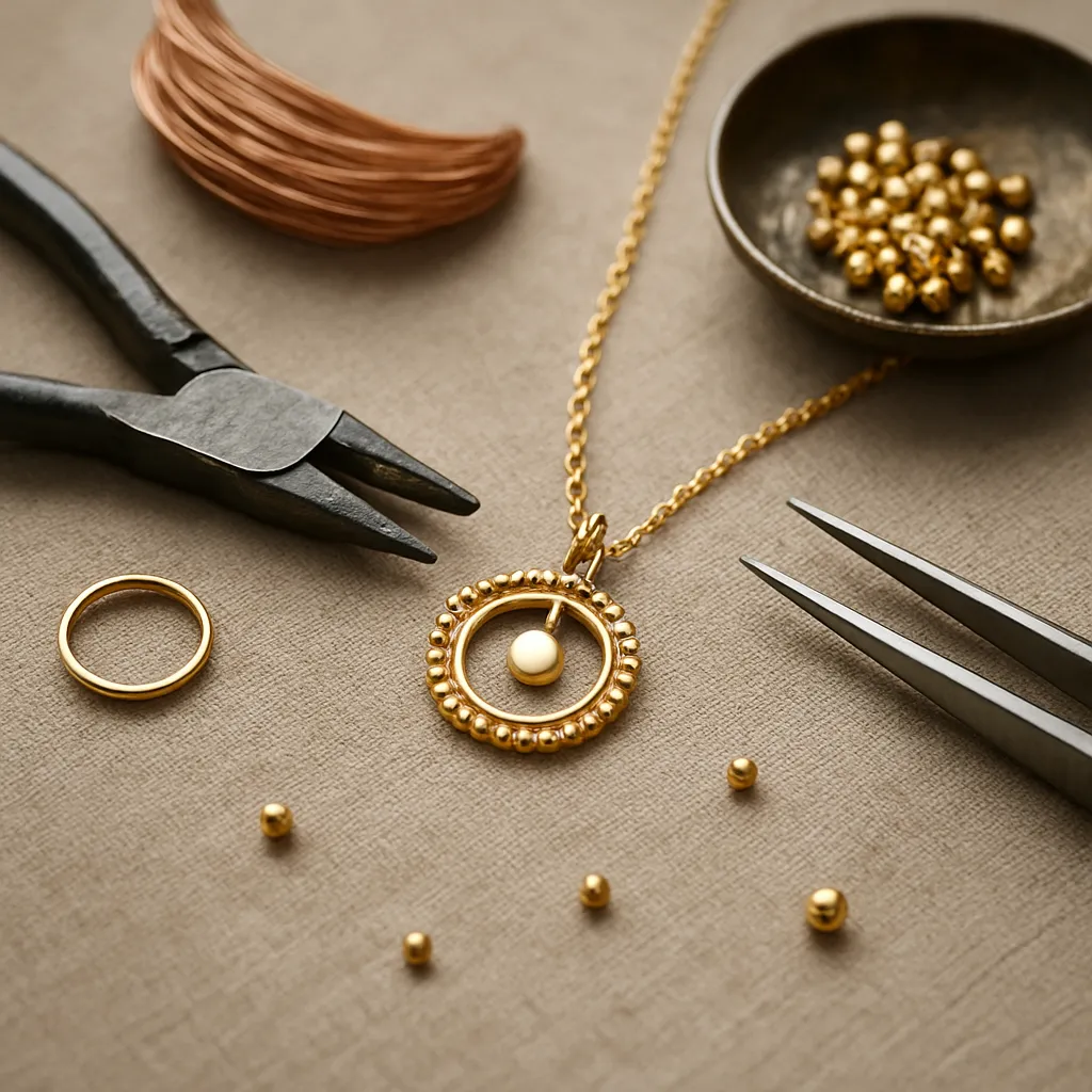
Jewelry design lives where human touch meets enduring materials: mind, eye, and hand shaping metal, stone, fiber, and glass into meaningful forms. For makers rooted in handicraft, the bench is not only a workplace; it is a thinking space where technical choices become aesthetic statements. The following guide distills core design principles into practical insights you can test at your workbench, whether you are soldering by torch, carving wax, weaving beads, or forming sheet with a planishing hammer. Think of these principles as tools you can pick up and set down as needed—ways to heighten clarity, refine intention, and transform technique into a voice that is unmistakably your own.
The Craftsperson’s Mindset
Design is not just what a piece looks like; it is how it is made, worn, repaired, and remembered. A craft-centered approach starts with observation: the habit of noticing how a clasp clicks shut, how light catches a bevel, how skin reddens under sharp edges, where a ring twists during daily tasks, and how a chain drapes along the collarbone. Curiosity drives small experiments—annealing a bit longer, scoring a fold a different way, swapping wire gauges, or altering a sawblade’s direction for a cleaner curve. Over time, those micro-decisions become the scaffolding of your aesthetic sense.
An effective mindset also embraces constraints—budget, time, tooling, skill level—as creative catalysts. Limited tools force ingenuity in form; a specific stone cut may dictate the geometry of a setting; recycled offcuts invite compositional play. Rather than resisting limits, use them as prompts to create focused, coherent work.
Composition and Visual Hierarchy
At the heart of jewelry that reads instantly and remains memorable is composition: the arrangement of forms, lines, masses, and negative space so the eye knows where to look first, second, and last. Visual hierarchy guides the viewer from focal point to supporting details. In a necklace, the focal point might be a bezel-set cabochon, with smaller granules or engraving acting as whispering accents that reinforce rather than compete with the centerpiece.
Consider three levers: size, contrast, and placement. Larger elements command attention; high-contrast edges and textures punctuate quiet surfaces; strategic placement—particularly along intersections such as the sternum or the mid-knuckle—anchors the eye. Use asymmetrical spacing to create dynamic flow, and leave purposeful empty zones so the main motif can breathe.
Negative space is as powerful as metal mass. Interior cutouts, pierced patterns, and open-backed settings lighten visual weight and invite light through the form. When in doubt, remove one element; less can often reveal more.
Proportion, Scale, and Wearability
Striking jewelry balances shape relationships within the piece and with the body. Proportion concerns how parts relate to each other, while scale considers how the whole sits on a specific wearer. A cuff may look bold on the bench yet appear timid at arm’s length; a dainty hoop may vanish beneath thick hair. Bring a mirror and test pieces on different body types to refine decisions about line thickness, gem size, and overall footprint.
Use proportion guides to keep forms coherent. Repeating ratio relationships—like large-to-small domes in a 3:2 or 5:3 relationship—creates subtle order. Even when improvising, let a recurring interval (bead spacing, link length, or notch depth) stitch the design together. In rings, consider knuckle-to-knuckle proportion; a top-heavy design may twist unless you distribute weight or widen the shank under the finger.
Balance, Symmetry, and Asymmetry
True symmetry offers calm and ceremonial presence, ideal for bridal pieces or heritage-inspired designs. Asymmetry can energize a composition, evoking movement and individuality. Neither is inherently superior; choose based on intent and wearer. Functional balance matters most: earrings that look symmetrical but pull differently will tire lobes, while asymmetrical earrings can feel perfectly even if their masses and centers of gravity align.
Develop a sense of balance through mockups. Pin paper or wax placeholders on a form to see how a necklace settles after a few steps, or hang prototype earrings and check the tilt as the wearer turns their head. Visual balance often correlates with mechanical balance, saving time you might have spent troubleshooting jump rings and counterweights later.
Rhythm and Repetition
Rhythm arises when elements repeat with variation: bead-bead-knot, link-link-ornament, groove-groove-smooth. It’s the heartbeat of a design, giving the eye a pattern to follow while allowing room for surprise. Vary one dimension—width, texture, or interval—while preserving another to maintain coherence. For instance, alternating hammered and satin-finished links of the same size creates gentle pulses of reflection without visual chaos.
In chain-making and bead weaving, rhythm becomes tactile. Fingers sense pattern changes faster than eyes—an aid for consistent craftsmanship and a subtle cue for the wearer’s own engagement with the piece.
Contrast: Light, Texture, and Color
Contrast is how you make features pop. On metalwork, juxtapose high polish against matte or stippled grounds; use shadows cast by piercings beside domed highlights. A line of blackened recesses can frame a bright stone; a brushed finish can soften a sharp silhouette so the contour, not the glare, becomes the star. In fiber or beadwork, alternate smooth glass beads with rough-cut stones, or pair matte seed beads with reflective bugles to animate the surface.
Color contrast is not only about opposites on the wheel; temperature and saturation matter. Warm citrine set in rose gold feels cohesive, while the same stone in cool palladium creates tension. Low-saturation stones (milky aquamarine, gray moonstone) often benefit from stronger metal textures to avoid looking washed out.
Color Theory for Metals and Gems
Think in palettes. Metals function like neutrals with personality: yellow gold warms and flatters reds and browns; white metals sharpen blues and greens; copper-based alloys add earthiness. Gem palettes can be built from analogs (adjacent hues) for serenity, complements (across the wheel) for pop, or triads for playful sophistication. When mixing metals, decide who leads. Let one metal dominate and the other accents; equal amounts can look indecisive unless intentionally patterned.
Remember environmental light. Gems that glow in daylight may dull under warm indoor bulbs. Test pieces under common lighting conditions, and if selling online, photograph under standardized light to set proper expectations.
Material Intelligence and Fabrication
Design flows from understanding how materials want to behave. Silver conducts heat quickly, making broad solder seams challenging; bronze work-hardens faster; 18k gold can take more deformation than 14k without cracking; titanium resists traditional soldering but welcomes cold connections. Stones have cleavages and Mohs hardness ratings that determine suitable setting styles. Fiber and leather swell and shrink with humidity; wood accents may require protective finishes.
Leaning into craftsmanship means engineering details from the start. If you plan to pierce many small windows, draw tabs into the design for structural bridges; if granulation is a hallmark, choose alloys and flux strategies early; if enameling, plan for wall height and counter-enamel to manage stress. Let technique and design co-evolve instead of forcing one to obey the other after the fact.
Ergonomics and Comfort
Jewelry sits on living bodies, so ergonomics trump theory. Weight distribution, edge treatment, clasp operation, and articulation determine whether a piece is worn often or retired to a drawer. Sand inner curves to mirror natural anatomy; soften transitions where skin flexes; avoid acute interior corners on cuffs; lightly break the edge inside rings to prevent chafing. Hidden counterweights can stabilize pendants and prevent flipping.
Plan for donning and doffing. Clasps should be operable with minimal fine-motor effort, especially for customers with arthritis. Test with damp or oily fingers. The more invisible the comfort, the more visible the pleasure of wearing. Never treat ergonomics as an afterthought; it is part of design DNA.
Structural Integrity and Durability
Beautiful jewelry fails if it breaks at the first snag. Map stress paths like an engineer: where a prong might catch, where a bail thins, where solder joints concentrate strain. Improve with thicker bearing surfaces, wider shoulders at joints, and gentle internal radii to reduce crack propagation. Choose joining methods appropriate to alloys and scale—hard solder for strength, laser welding for heat-sensitive zones, rivets or screws where maintenance access is needed.
Surface hardening techniques (work hardening, burnishing, shot peening) extend life. Match chain gauge to pendant weight; select findings rated for load; test by intentional stress—tug, twist, drop—before releasing to a client. A reputation for durability is a design asset as valuable as style.
Surface Finish and Tactility
Tactile experience shapes emotional memory. A stone with a silky cabochon dome invites touch; a vellum-satin finish whispers luxury; a hammered texture telegraphs handmade vigor. Layer finishes: polish only ridge lines so they sparkle against a hazy field; use directional satin to guide the eye; patinate recesses to add optical depth. Monitor how finishes wear—mirror polishes show micro-scratches quickly, while fine matte hides them but can pick up stains. Choose for the piece’s intended life.
Storytelling and Cultural Context
Jewelry carries narrative—of place, heritage, ritual, or personal milestones. Decide what story your piece tells and strip away anything that muddies it. Referencing motifs from specific cultures demands respect; study meaning, credit inspiration, and avoid token gestures. Abstract storytelling can be equally potent: a repeated notch pattern may encode a memory; a found object setting may honor an everyday ritual.
Clarity of storytelling also helps customers connect. A concise card or caption can link design choices to intent: why this pattern, why this metal, why this finish. When the narrative aligns with form and function, the result feels inevitable rather than decorated.
Sustainability and Ethical Sourcing
Every material has a footprint. Consider recycled metals, traceable gems, and responsible studio practices. Minimizing waste—nesting patterns in sheet, reclaiming filings, repurposing offcuts—reduces cost and environmental impact. Non-toxic pickles and patinas protect your health and the watershed. If using rare or culturally sensitive materials (coral, ivory substitutes), understand regulations and offer transparent provenance statements.
Integrate sustainability into your brand promise: repair programs, trade-in policies for redesign, and educational care guides extend the life of your work and build trust. Design for disassembly where possible so components can be replaced or recycled down the line.
Pricing, Value, and Perceived Quality
Design affects perceived value as much as gemstone carat or metal weight. Precision of lines, crispness of edges, and thoughtful finishes read as quality. So do packaging, documentation, and photography. Price from a foundation of costs plus profit, but allow design to justify the number: unique mechanisms, hand-finished textures, or articulated forms communicate effort and originality.
Be wary of over-building. Extra features that don’t serve function or narrative can inflate labor with little return. Edit ruthlessly so every element earns its place and its share of the price.
Prototyping, Iteration, and Critique
Paper, clay, wax, or 3D prints accelerate learning. Rapid prototypes reveal fit issues and test motion. A brass mockup might settle differently than gold; a PLA print can flag sharp edges before metal is cut. Iterate with intention: change one variable at a time—link length, stone size, hinge thickness—so you can attribute the outcome to a specific choice.
Seek critique from peers and wear-testers who will be honest. Ask where the eye lands, where the piece rubs, how it behaves in real life—tying shoes, lifting a bag, typing. Document changes so patterns of improvement become part of your process library.
Photography and Presentation
Great design must be communicated. Photograph with consistent lighting that flatters metal and stone without distorting color. Use neutrals for clarity, then add lifestyle shots to show scale and context on a body. Controlled reflections emphasize edge definition; diffused light minimizes hotspots. Capture front, side, back, and clasp details; show how a mechanism works. Presentation reinforces your design principles in the buyer’s mind.
Care, Maintenance, and Longevity
Design for the future you promise. Provide care instructions tailored to materials: gemstone hardness, sensitivity to chemicals, recommended cleaning methods. Offer refinish services and replacement components. Plan finishes and settings that can be renewed without destroying the piece. If patina is deliberate, indicate where it will naturally evolve and how to refresh it. Longevity is both a technical and a relational design decision.
Building a Signature Style
A recognizable style emerges when constraints, materials, and principles converge consistently. Pick a small set of moves—an edge bevel, a hinge style, a texture, a motif—and deploy them across forms. Let your palette and proportions be your voice. Over time, your audience will recognize your work from a silhouette alone.
Resist the urge to chase every trend. Incorporate only what strengthens your identity. Trends pass; fluency in fundamentals compounds.
Common Pitfalls and How to Fix Them
- Too many focal points: Reduce to one star and two supporting actors. Remove or subdue competing details with matte finish or scale reduction.
- Uncomfortable edges: Break all edges that touch skin. Use light chamfers and progressive grits; polish interiors as carefully as exteriors.
- Top-heavy rings: Widen the shank under the finger, add inner sizing beads, or re-engineer the top to lower the center of gravity.
- Flipping pendants: Adjust bail position, increase bail friction, or add counterweight elements on the chain.
- Muddled metal mixes: Design a dominant metal and assign the other as a consistent accent, or separate metals into distinct zones.
- Stones dull in setting: Open backs for translucents, add reflective seats for faceted stones, or increase light entry with pierced galleries.
- Weak solder joints: Increase joint area, improve fit before soldering, choose appropriate solder grade, and manage heat with proper sequencing.
- Incoherent series: Define a rule set (motif, ratio, texture) before producing variants; hold every new piece up to the rule set.
Practical Design Checklists
Before You Start
- Intent: What emotion or use-case guides this piece?
- Constraints: Budget, time, tools, and materials defined?
- Palette: Metals, stones, finishes chosen with rationale?
- Wearer: Body placement, size range, and lifestyle considered?
During Prototyping
- Hierarchy: Is the focal point clear from arm’s length?
- Proportion: Do parts relate through a repeatable ratio?
- Balance: Does the piece hang or sit without twisting?
- Comfort: Any edges or contact points that irritate skin?
- Mechanics: Clasps, hinges, joints tested under stress?
Before Release
- Finish: Are surfaces consistent and intentional?
- Documentation: Care, materials, and provenance explained?
- Photography: Scale, detail, and color accurately shown?
- Serviceability: Can parts be repaired or refinished later?
Case Studies in Principle-Driven Design
A Minimalist Signet Ring
Goal: quiet authority. Choose a low-dome top with a softened rectangle, beveled edges that catch light, and a subtle brushed field. Hierarchy centers on the planar top; sidewalls taper for comfort and to prevent twisting. The underside is smoothly broken to avoid hotspots. Material choice is a white metal to emphasize geometry. Final touch: laser engraving kept shallow for easy refinishing and long-term legibility.
An Asymmetric Gem Pendant
Goal: dynamic flow. Set a marquise citrine along a diagonal axis; carve a negative-space echo on the opposite side to counterbalance mass. A textured matte field contrasts with polished ridge lines. The bail sits slightly off-center but is angled so the piece hangs upright. Chain weight matches pendant mass. The design reads as movement without sacrificing wear stability.
Textile-Inspired Hoop Earrings
Goal: rhythmic tactility. Create hoops from fine square wire with a repeating notch pattern—two short notches, one long—mimicking a weave. The repeating interval creates rhythm; the square section gives crisp reflections. Ear wires are forged to spring tension, and ends are micro-beveled for comfort. Matte finish inside, bright outside, so the outer edge flashes as the wearer turns.
Bringing Principles to the Bench
Turn abstract ideas into bench habits. Keep a proportion card at your station with favorite ratios and common ring widths. Maintain finish samples—a strip of metal showcasing grits, patinas, and textures—to test against stones. Build a hinge and clasp library so you can drop in proven mechanics without re-inventing each time. Photograph prototypes on a body form the same day you make them; distance and context will reveal compositional truths your bench lighting hides.
Most importantly, design with time. Allow space between iterations so your eye resets. What felt exciting yesterday may feel noisy today; what seemed plain may now read as refined. Distance is a powerful design tool.
From Principle to Signature
When you consistently apply fundamentals—clear hierarchy, surefooted proportion, intentional contrast, humane comfort, and reliable structure—your work gains coherence. Coherence invites trust: clients understand what you stand for, why your pieces wear so well, and how they will age. From there, every new collection becomes an evolution rather than a departure, a conversation between what you’ve mastered and what you’re still discovering.
The bench has always been a place where knowledge accrues in layers: tool marks that teach, failures that refine, small victories that stack into fluency. Keep tuning your eye; keep listening to materials and bodies; keep editing toward clarity. In that steady practice, you’ll find not just better jewelry, but a practice that sustains you as surely as metal holds a stone.
Key Terms to Keep in Mind
- harmony: the satisfying relationship among parts that makes a piece feel whole.
- Negative space: the intentional emptiness that shapes the form around it.
- Visual weight: how heavy an element appears, affected by size, texture, and placement.
- Hierarchy: the order in which the eye reads information.
- Articulation: joints or links that introduce motion and comfort.
- Patina: controlled oxidation or coloration of surface metals.
